
Have you ever thought of the hard work behind designing a data table? It’s not only time-consuming but it involves tons of mental effort as well!
Join me on an exciting exploration of the complexities of designing and utilizing tables for data visualization.
Research is a great ally, but first things first
Everything starts with some exploration. Surfing over multiple websites and getting to read lots of articles is always a good practice to follow and certainly, there’s no need to reinvent any wheel here.
On the other side, get to know your goals…what are you researching for? To Design a specific table? Is it just one design or more than one? Create different types of tables according to specific needed scenarios.
Once you gather some valuable information and prioritize all those ideas flying around in your head, you get to organize all that information and start working with it.
It’s not easy though; confusion and anxiety will arise, but once you get this first step done, you’ll notice that you have to keep on going, and when you get to define what you need to design a data table, then you may ask yourself…“Is that it?”
Well no, my friend! There’s a lot more behind the scenes.
In my personal experience, despite not being a Data Visualization expert, I must admit I was confident when assigned the task of researching tables. I thought to myself, “Piece of cake! How hard could it be? I only have to do some research and define my goals”. Little did I know, the complexities that awaited me were far beyond my expectations.
The bottom line is that I needed to recognize different scenarios which required different kinds of tables designed. Initially, I managed to divide into three main types of table designs: simple tables, actions & filtering-capability tables, and editable tables.
Of course, each of them had its complexity…
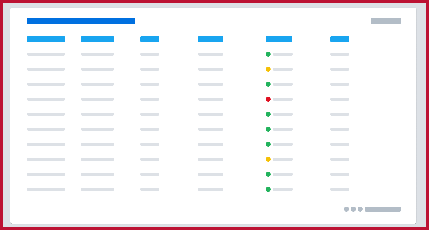
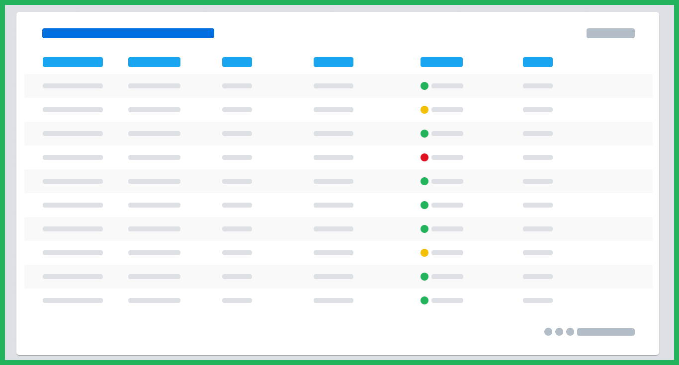
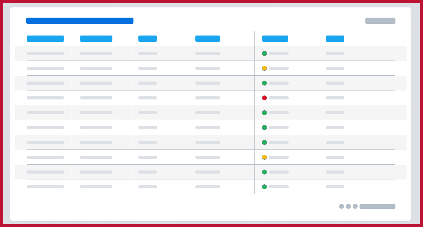
Simple tables were the easiest ones, with almost no user interaction rather than scanning information. Users aren’t able to edit or search for data, even so, there’s no filtering data needed.
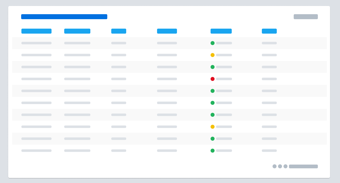
Overall we can see here just about a title, a couple of columns for the user to clarify information, and that’s it. Simple, clear, and easy to understand. These tables are known as ‘read only’ tables.
Following up Actions & Filtering-capability tables. These are similar to read-only tables but still aren’t fully editable.
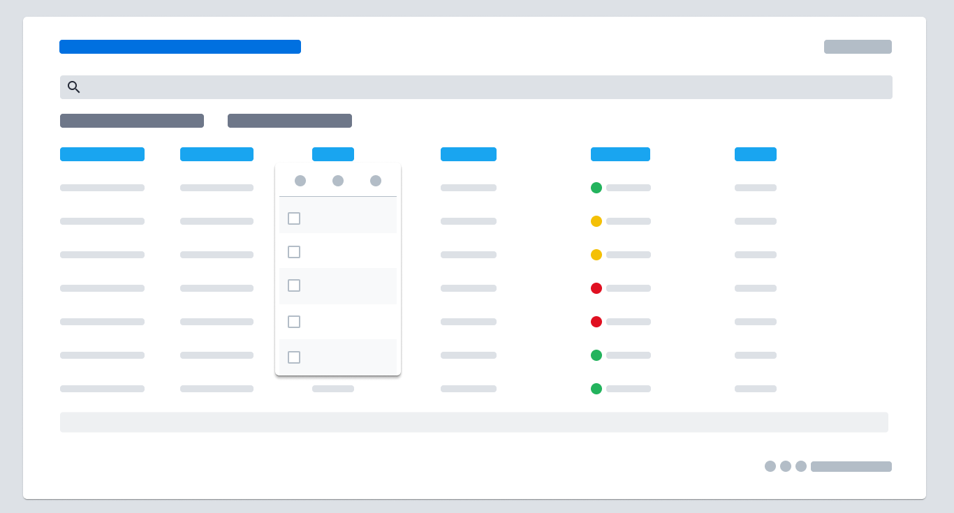
Users have some extra functionalities; In addition to current components, we can add the ability to search (search bar), column pinning, and filtering as the most common actions to manage information in a much more comfortable way.
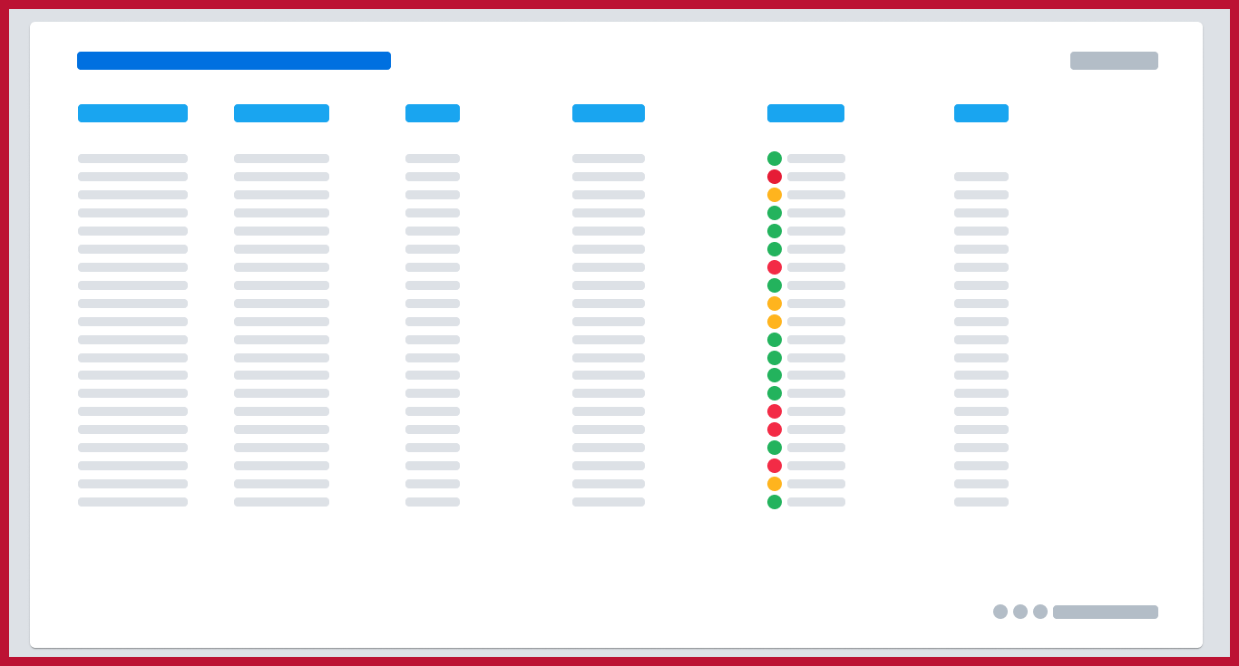
Finally, on a third level of complexity, Editable tables. Mainly focused on row actions; individual or bulk selection, expandable rows, and inline editing.
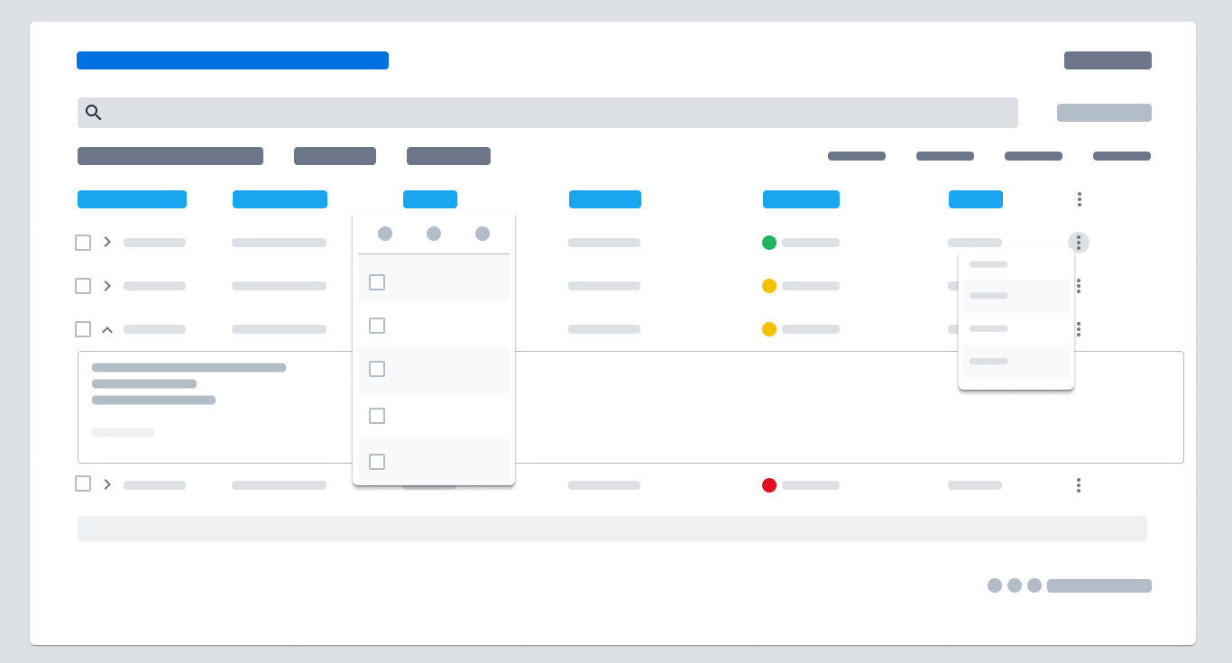
Even users have the chance of adding child rows and extra information within the main rows. This is mostly needed to solve complexity over tons of information.
Super simple and clear right? Well, that’s because I oversimplified the explanation here. Believe it or not, this is the tip of the iceberg on my journey. Still today I am iterating to generate better and more accessible tables for data visualization for the client I work with. It never ends.
My research process made me think about tables -and their components that all together build a table as such- in a different way:
“Discovering and analyzing tables is like the process of peeling the layers of an onion, but it also works in reverse”
You know, onions have different layers one on top of the other; together they form what everybody knows as an onion. Onions arrive to our hands already built, and what we do with them is to peel the layers off. If we reverse the process and instead we start putting together different components (layers of the onion), we’ll build a pretty decent, neat, structured, and well-designed table. Some general insights about tables’ features to achieve:
- Easy to scan.

- Provide less confusion and more clarity when it comes to handling information.
- Avoid excessive clutter.
- Be minimalistic, from a design perspective.
And what makes my (your) design unique?
To continue with some personal thoughts, I think that Identifying the unique aspects of a design is a good place to start. And this is very important to think of in terms of building a table because it requires careful consideration to make your table distinctive. Certainly, you’ll have to be patient and learn from your own mistakes (and from the user as well) and, in my humble opinion, mistakes teach me every day the value of user feedback, scalability, and iterative design.
“A data table’s value to the user determines its quality. A well-designed table offers significant utility and tangible benefits.”
Value is the most important thing that a table should have, and you build value along all of the simple concepts mentioned above.
Love them or hate them.
Tables are one of the most commonly used UI components in web and mobile applications. They are used to display a lot of data in a structured and organized way. Broader speaking, designing tables for data businesses is (still) a challenging task, this is because they can quickly become overwhelming and hard to read if not designed correctly.
“Tables can be simple or complex, depending on the data and the context in which they are used”
In either of them, the goal is to achieve a clear structure, simplicity, and functionality.
Some final thoughts
We can’t leave behind the different components used within a table (headers, footers, search bar, filtering capability, icons, field inputs, expansion panels, error scenarios, and more). With these into account, I list below my top 10 considerations while building a data table: -remember, not everything has to be part of your table; unnecessary features should be left aside if not needed, avoiding cluttering-
- Simplify: Keep tables easy to read and concise. Avoid clutter and limit rows and columns to reduce cognitive load.
- Headers and Footers: Provide context and summarize data. Make them distinguishable and aligned with columns.
- Row Striping: Alternate background colors to aid readability. Keep it subtle and consistent.
- Sorting and Filtering Allow users to organize and search data easily. Make sorting and filtering options accessible.
- Pagination: Break large tables into manageable pieces. Intuitive navigation buttons improve usability.
- Responsive Design: Adapt tables for different screen sizes and orientations, ensuring readability.
- Tooltips: Informative pop-ups for additional data. Design them to be unobtrusive and responsive.
- Accessibility: Implement features for users with disabilities, such as alternative text and keyboard navigation.
- Consistent Design: Maintain uniform colors, fonts, and styles for a cohesive user experience.
- Test and Iterate: User testing and iterative improvements are vital for effective table design.
Designing tables for data businesses is a challenging task, as I have experienced firsthand. However, it’s also an enjoyable journey and, truth be told, nothing’s written in stone. Thank you for taking a couple of minutes of your time to read and
learn from my experience!
Question for you now…what would your next data table be about? :)