
First let’s capture user’s click to move a square on a non-rotated container. For this we’ll build a very basic vanilla JavaScript app which consists of two parts:
- Rendering the elements, red rectangle and a small blue square.
- Using event listener to capture user click and move the square.
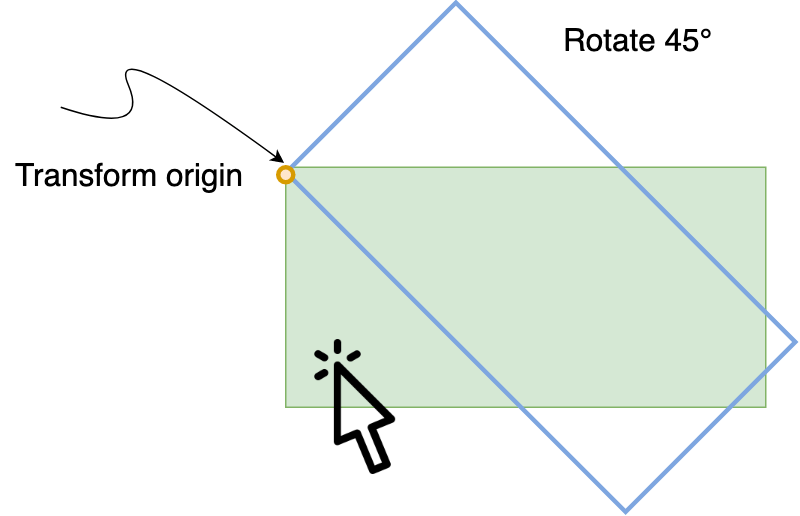
Now let’s rotate the red rectangle/container and see what happens!
#page {
  transform: rotate(90deg) translateY(-100%);
  transform-origin: left top;
}
Note: we’re setting the transformation origin to left, top to make further calculation simpler, and we’re moving/translating Y to move the container to the original position (#1).
We expected it to work out of the box right? let’s see what’s happening.
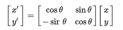
It turns out that the click event doesn’t get transformed with its container as we may have expected, so basically we’ll have to handle the transformation manually, using the following 2d rotation matrix (clockwise direction) we can get rotate the user’s click coordination to the same clockwise 90°:
In JavaScript this could be something like this:
// Get the container height
const { offsetHeight } = document.getElementById("page");
// Angle in radians
const angle = 90 * (Math.PI / 180);
const cos = Math.round(Math.cos(angle));
const sin = Math.round(Math.sin(angle));

// Apply the rotation matrix
const rotatedLeft = clientX * cos + clientY * sin;
const rotatedTop = -clientX * sin + clientY * cos + offsetHeight;
// we've to add offsetHeight in this case, because of (#1) correction.
As we’ve seen we need to apply exactly the same applied transformation within CSS from JavaScript side, unfortunately we had to do it manually applying some lineal algebra.
Finally the study case is only for 90°, but the same logic can be applied to get other notable angles working.
