
For the past few years, I’ve been mainly developing solutions related to data visualization. When the latest OpenAI GPT model was released a few months ago, my manager called me on hype because he had been trying it with some CSV datasets, and the model seemed to understand and summarize the data.
I started to play with the completion API right away, and after a while, I realized that I could give context to the AI and make it respond only using JSON responses.
Then, the idea just clicked: If I send some dataset to this new AI and ask for a specific JSON response, I can create a dynamic data visualization dashboard generator that will generate filters, indicators, and appropriate charts for the data at hand.
How to talk with GPT?
At first, I struggled because I didn’t know how to talk with GPT, so I loaded one of the examples in the playground called “Chat”, then started to paste some data and ask questions about it.
The following is a conversation with an AI assistant. The assistant is helpful, creative, clever, and very friendly.
Human: Hello, who are you?
AI: I am an AI created by OpenAI. How can I help you today?

Human: Given the following dataset
Name LastName Salary
John Doe 100k
Jane Doe 110k
Give me a description about it
AI: ...
After a little investigation, you apparently could change the headers of these conversations and make them answer differently, giving it the profile of an expert on data science, for example.
Make GPT answer with JSON responses
Then the idea popped, I could give it a header saying this:
The following is a conversation between a Human and an AI assistant expert on data visualization.
The human will provide a dataset for the AI to use as a source.
The AI assistant will only reply in JSON format, providing a list of at least three different charts.
The response of the AI should look like this: {
   "charts": [
     {
       "chartType": string,
       "xKey": string,
       "yKey": string
     },
     ...
   ],
}
The chartType key should be one of barChart, lineChart, and pieChart, depending on whether the data allows for the given chart.
The xKey and yKey will be the keys used as the x and y axes.
Human: INSERT_DATASET_HERE
AI: ...
…then the AI responded
...
AI: {
   "charts":[
     {
       "chartType":"barChart",
       "xKey":"Manufacturer",
       "yKey":"Sales_in_thousands"
     },{
       "chartType":"lineChart",
       "xKey":"Year",
       "yKey":"Sales_in_thousands"
     },{
       "chartType":"pieChart",
       "xKey":"Vehicle_type",
       "yKey":"Sales_in_thousands"
     }
]}
And that’s it; I only need to parse that data and render it on React.
Going a little bit further
In data-visualization dashboards, we usually don’t have charts only. Some other present objects are filters and KPIs (key performance indicators).
So maybe if I tweak the input a little bit:
The following is a conversation between a Human and an AI assistant expert on data visualization.
The human will provide a dataset for the AI to use as a source.
The AI assistant will only reply in JSON format, containing a list of 3 filters that can be used to filter the data, a set of 3 key performance indicators that can be helpful, and a list of 3 charts that can be displayed using the data.
the response of the AI should look like this: {
   "charts": [
     {
       "chartType": string,
       "xKey": string,
       "yKey": string
     },
     ...
   ],
   "filters": [
     {
       "title": string,
       "key": string
     },
     ...
   ],
   "kpis": [
     {
       "title": string,
       "javascriptFunction": string
     },
     ...
   ]
}
The KPIs's javascriptFunction should be a predicate that can be used to operate over the rows of the data and get the desired KPI value.
The filter's key should be the dataset column name that can be used to filter the data.
The chartType key should be one of barChart, lineChart, and pieChart, depending on whether the data allows for the given chart.
The xKey and yKey will be the keys used as the x and y axes.
Human: INSERT_DATASET_HERE
AI: ...
And to my surprise, it worked:
AI: {
  "filters": [
   { "title": "Vehicle type", "key": "Vehicle_type" },
   { "title": "Price in thousands", "key": "Price_in_thousands" },
   { "title": "Engine size", "key": "Engine_size" }
  ],
  "kpis": [
   {
    "title": "Average price in thousands",
    "javascriptFunction": "data.reduce((acc, item) => acc + item.Price_in_thousands, 0) / data.length"
   },
   {
    "title": "Average engine size",
    "javascriptFunction": "data.reduce((acc, item) => acc + item.Engine_size, 0) / data.length"
   },
   {
    "title": "Total sales in thousands",
    "javascriptFunction": "data.reduce((acc, item) => acc + item.Sales_in_thousands, 0)"
   }
  ],
  "charts": [
   { "chartType": "barChart", "xKey": "Manufacturer", "yKey": "Sales_in_thousands" },
   { "chartType": "lineChart", "xKey": "Year", "yKey": "Sales_in_thousands" },
   { "chartType": "pieChart", "xKey": "Vehicle_type", "yKey": "Sales_in_thousands" },
  ]
}
Try it!
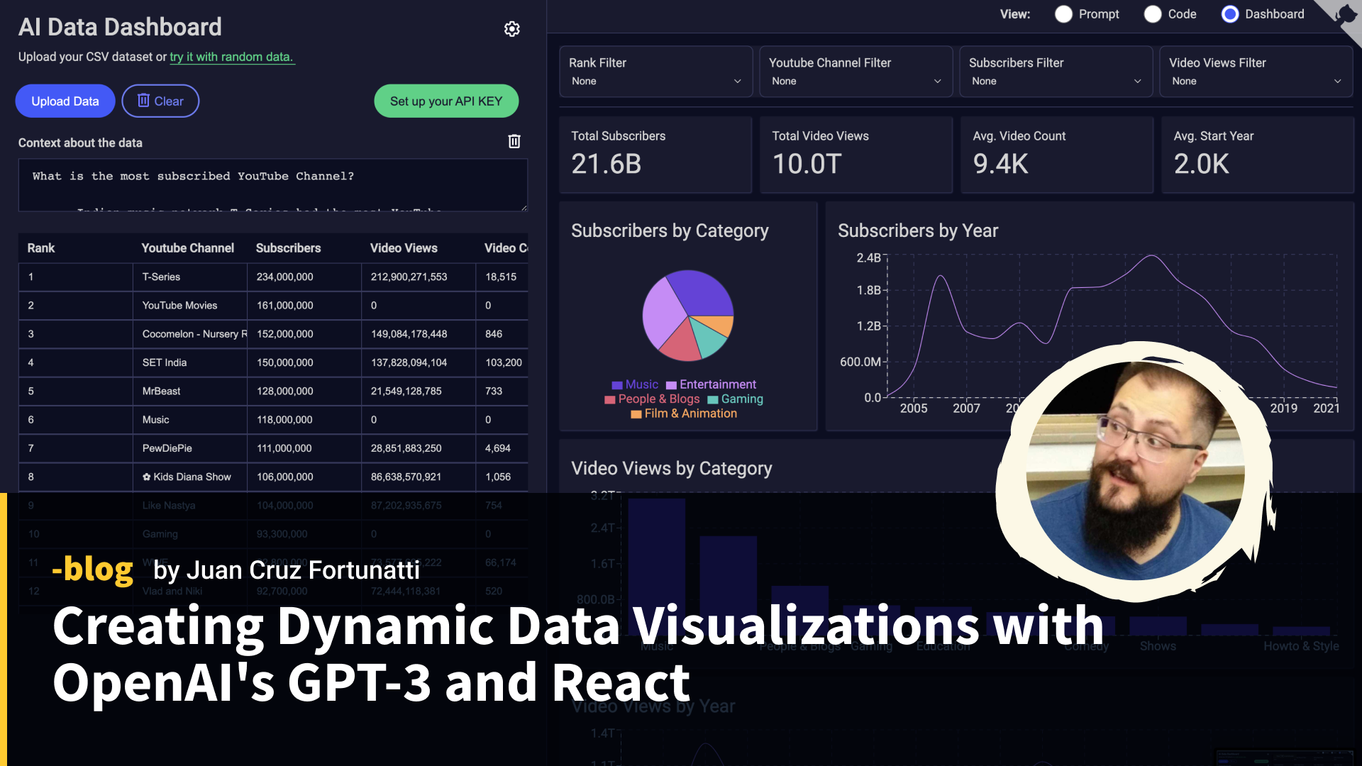
At Leniolabs, we have implemented a version of this idea; of course, we made it open-source, so you can also try it in your local environment.
To analyze your datasets, you will need to use your own OpenAI’s API KEY.
Conclusion
I’m amazed… scared too. Because all we discussed here is something that can be achieved with a query that costs as little as $0.02. If we split this into several queries and give more context about the data, the possibilities are endless.
The key point is that with this approach, you don’t need to send ALL the data to the endpoint with just a sample of a few records. It’s enough since all the calculations will be handled later in the app.