
We are happy to announce the v2 release of grid.layoutit.com!
We have been working these past months to revamp the user experience of Layoutit Grid, introducing support for most features of the CSS Grid specification. We spent a lot of time thinking how to introduce these features, and we are proud of the results: layoutit v2 feels more polished, is easier to use and more powerful than ever. We built this tool not only as a generator, but also as a learning tool. You should definitely learn CSS grid, we are just here to make that process easier.
Also, open sourcing our CSS Grid Generator has been a great experience for Leniolabs_, and it pushed us to get more involved as a company in open source. Because of this we started a sponsoring program and we are actively collaborating in external OS projects.
So, here we go again! These are the new Layoutit Grid features.
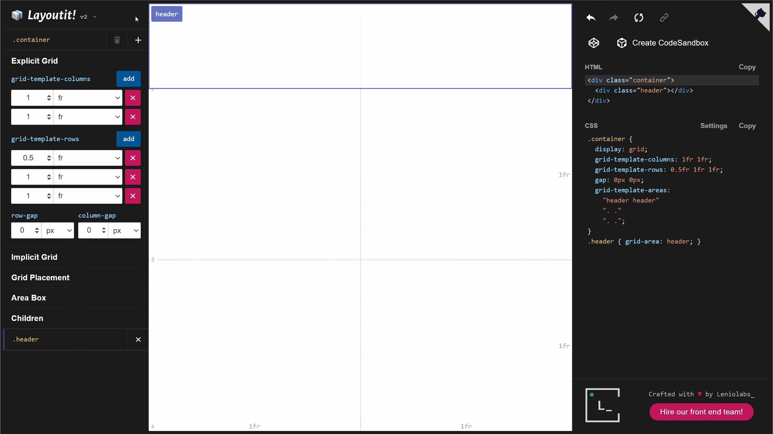
Area Childrens in the sidebar
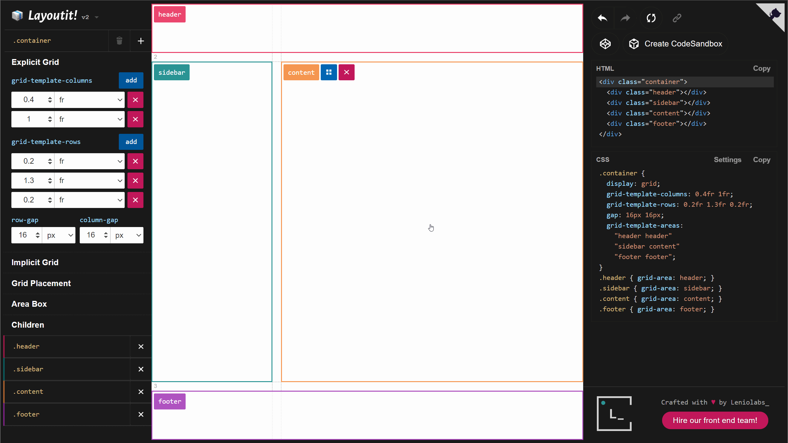
When you are editing an area, the sidebar will now show their parents and direct children so the layout tree is easier to navigate.
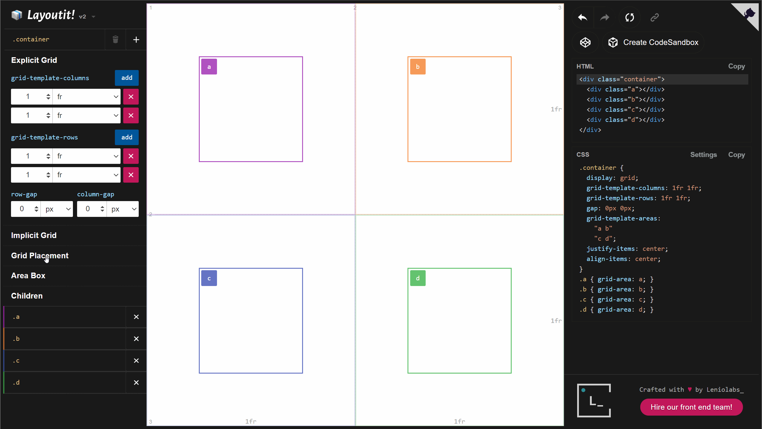
Auto placed Areas
The CSS Grid spec supports areas that are auto-placed, fitting in the first empty cells of the grid. Layoutit Grid v2 gives you the option to create Auto Placed areas by pressing the [+] button in the sidebar. You also have access to the grid-area prop to switch between explicit and auto placement.

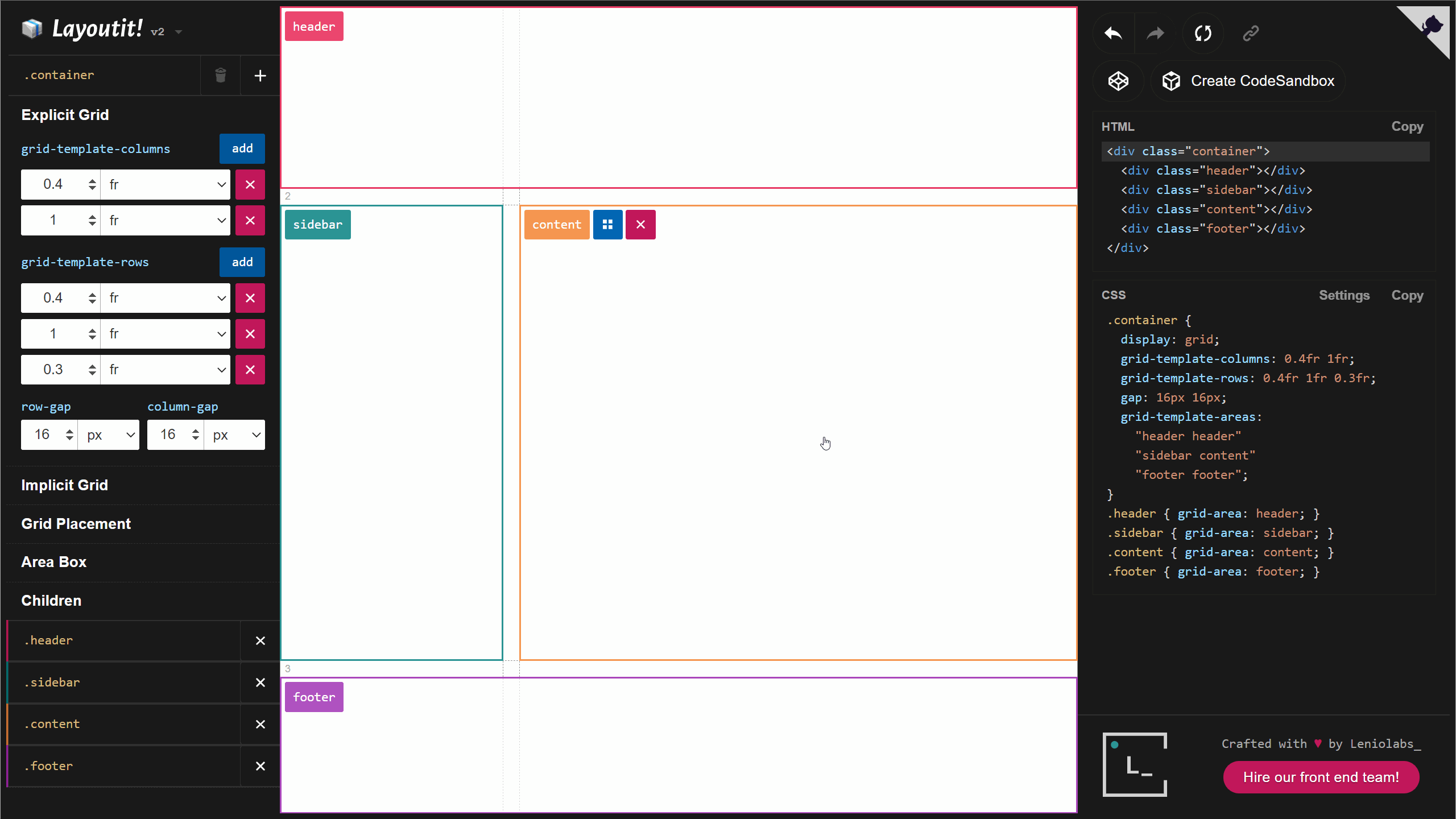
The Implicit Grid
If you add more areas than you can fit in the explicit grid, a new row or column (depending on the grid-flow property) will be automatically added to the grid. This extended grid is called the Implicit Grid, and we have full support for it.
Aligning Items and Content
With the justify-items and align-items properties you can control the position of areas in the rows and columns. Each area can override the parent values using justify-self and align-self
Aligning Content
When grid items are sized with non-flexible units like px, the size of the grid could be less than the size of the container. In this case you can set the alignment of the grid within the grid container using justify-content and align-content.
Resizable Viewport
You can now resize the main container to test how your layout looks in different sizes without having to resize the window.
CodeSandbox Support
On top of exporting to CodePen, we now support CodeSandbox (with more options to come in the near future).
A dream stack
Layoutit Grid is built with Vue 3 and Vite. You can learn more about why we love to develop using this stack in these videos: Layoutit Grid is now Open Source and Vite is here
Get in touch
We hope you enjoy the new Layoutit! Star our repo, and collaborate with us to keep improving the application. And if you’re facing interesting problems in your company, we are always looking for new challenges for our frontend team at Leniolabs_.
