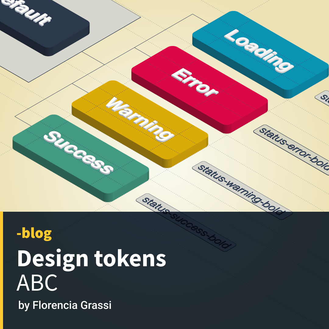
Design tokens are digital representations of design elements that can be used to create a consistent and cohesive visual style across a variety of platforms and applications.
Born in the context of design systems, they became a solution to improve communication and collaboration between design and engineering teams. They ensure that our design brand is consistent throughout all our products by keeping a single source of truth to communicate and share our design decisions. Helping us save a lot of time and effort (especially in larger organizations) as they let us scale and update our design systems efficiently from one place, maintaining all our products in sync and allowing our design decisions to be documented in a platform-agnostic and shareable format.
Anatomy of Design Tokens
But what are they really? We could think of them as an alias or a label to use in place of an actual value. They are a semantic naming convention that can replace design choices. So when engineers implement a said design, they don’t have to worry about changes in the design system or hex values for colors; they only focus on a nickname that represents those values.
As the Design Token Community Group (DTCG) says:
“A Design Token is the single source of truth to name and store a design decision, distributed so teams can use it across design tools and coding languages.”
Each Token Name can have different properties: Value, Type, Metadata, and Description. Being Name and Value the minimum information needed to declare a Token.
If you are a designer, you might be familiar with some popular design tools that help design, create and edit our Tokens. Some are Figma, Photoshop, XD, Inkscape, and Sketch, among others.
If you are a developer, design token files are in JSON format because of their familiarity, their huge adoption, and because they help lower the barrier to any person with access to a basic text editor.
This is an example of a minimal file with a single design Token taken from W3C:
{
  "token name": {
    "$value": "token value"
  }
}
Types of design tokens
Global tokens
These are the most common tokenizable values that define visual elements:
- Color, opacity, shadow
- Icons
- Font size, weight, family, letter spacing, line-height
- Spacing, breaking points in media queries, transition, z-index
For example the value #E39A77 🟧 → orange-main
By using a nickname like this, the engineer won’t have to worry about design choices and the designer will be able to make changes in the future with confidence that the code won’t be harmed.
Alias Tokens
These refer to a specific context, like the purpose of a token. Instead of referring to the orange for what it is, we’ll be calling it by what it does.
For example orange-main → background-primary
This way our tokens are associated with meaning or context. By doing this, it will be very easy for the developer to update any color across the platform. It will also allow us to maintain a high consistency across our product’s UI and a huge efficiency in managing updates in our design systems.
Component-specific token
These relate to a specific component using them. Their scope only targets the component they belong to. Component tokens communicate not only the targeted properties but also their states. They usually inherit part of their name from alias tokens, and they help the engineer to be very specific when applying them.
background-primary → button-background-primary
Translation tools
Many translation tools help compile our tokens data into different export formats for our projects. This aim to close the gap between design and development to keep everyone on track. Some tools focus more on managing design tokens with code, while others serve as a library to keep things organized.
With tools like these, working with diverse teams will be simpler. But it’s also helpful to keep our brand guidelines in one location so we can distribute them in whatever format is needed by any design or development team. For a customer that has to expand on their particular projects or a business that needs to take its first steps in organizing its design decisions, we may also start by developing a design system here.
That’s why we created Layoutit Tokens, a free and open-source Design Token Generator where anyone can load their design decisions (like color palette, spacing, font family, letter spacing, font size, line height, shadow, opacity, radius, easing, duration, and media queries), and after that, export a JSON, DSP, Theo, CSS and SASS code.
We believe anything that improves the communication and collaboration of diversified teams is a step forward for the whole community. As a company that has been actively working with design systems, we see the value of the efficiency and consistency of updating, scaling, and improving our products and services from one single place.


