
So you want to include accessibility in your design work-flow? Let’s explore how.
Accessibility Tools Series
This small project includes:
Part I → Validators and Checkers for Devs and QAs
Part II → Tools and tips for Designers
When I envisioned this small series I set as a goal to show resources that can help improve the accessibility of digital products. More specifically, I wanted to show tools that could be added to our work-flows. During the research phase for these posts I also found interesting articles that were included as “recommended reads” to extend on these topics. So you will find a mix of both on each topic mentioned.

But before we start, as the title reads, this post is oriented for designers. In case you are looking for tools aimed for Developers and QAs check out my previous post here.
Without further ado…
For a long time accessibility has been an afterthought in the development process of sites, apps, and whatever thing you wanted to run on the web. In recent years, there has been a shift in the industry towards inclusion, better user experiences, and making the web a more emphatic place. By having empathy with your users, you are not only designing for your client but for anyone that will use what you design. And that includes people with disabilities, may they be permanent or temporary.
There are many kinds of disabilities that we have to consider in our processes, for example, the WHO reported that “at least 2.2 billion people have a vision impairment or blindness, of whom at least 1 billion have a vision impairment that could have been prevented or has yet to be addressed. These 1 billion people include those with moderate or severe distance vision impairment or blindness due to unaddressed refractive error, as well as near vision impairment caused by unaddressed presbyopia”.
“At least 1 billion people have a vision impairment that could have been prevented.”
Accessibility needs to start on the design phase to make sure we are delivering products that can be used for as many people as possible. It’s not a matter of being compliant only, but it also is an ethical ‘ought to be’ that we have. Although we can detect errors later on the product development lifecycle, if we work on it from the start then we’ll avoid lots of accessibility errors upfront. Let’s see some areas where we should pay attention to.
Color
Color is one of the main topics when we talk about accessibility and design. The way we use it in our designs affects the way the content is perceived by our users so we need to be careful with the decisions we make about it.
Recommended reads
I won’t dive much on ‘color theory’ since it’s out of the scope of this post, but there are lots of interesting articles that I recommend reading. For example, the color management series by Banjo consists of 3 parts that tackle topics like spaces, gamut, and software settings. Alpha compositing and Color spaces by Bartosz Ciechanowski are long but interesting for sure. Another good long read, Color: From Hex codes to Eyeballs by Jamie Wong. And finally, Color meaning and symbolism by the guys at Canva.
The following posts focus specifically on accessibility and color:
-
The first one from Justin Reyna has useful recommendations to check out.
A guide to color accessibility in product design | Inside Design Blog -
The guys at Stripe have written a great post on their experience improving color accessibility. They give interesting takeaways from what they learned.
Designing accessible color systems -
Stephanie Walter wrote a nice piece on how to produce accessible color palettes.
Tips to Create an Accessible and Contrasted Color Palette by Stéphanie Walter -
And Zain Adeel wrote an article about creating a good color system. He tells us that to achieve that it has to be accessible, systematic, and scalable.
My struggle with colors
Tools
There are many many tools to create color palettes out there, so I will focus on those that are accessibility-oriented.
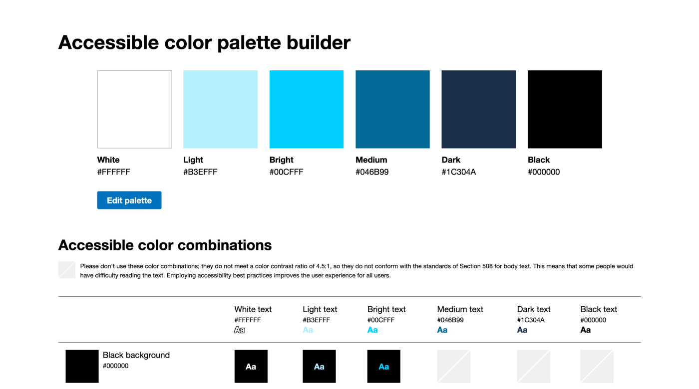
• Accessible color palette builder
I like this tool because you can see the relationship between colors on your palette and which combinations have a good contrast ratio.
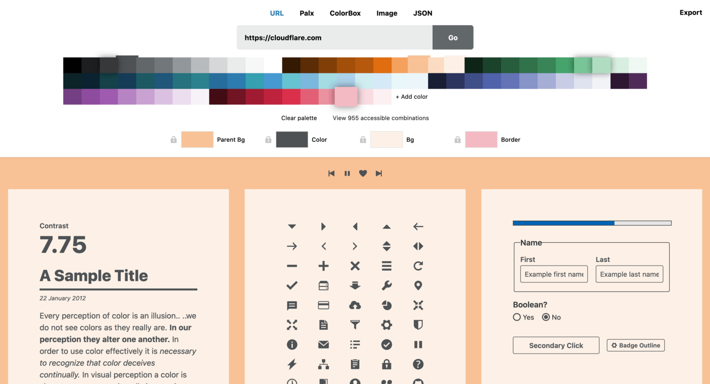
• Cloudflare Design Color tool
This tool can help you preview different color combinations with typical elements. I recommend reading this post where they explain their experience improving color usage, similar to the one from Stripe mentioned before.
• ColorSafe
ColorSafe works by giving it a background color and setting a text style. Then, the tool shows you different colors and shades that have the recommend contrast ratio required by the WCAG Guidelines. A pretty useful tool to create color combinations with good contrast.
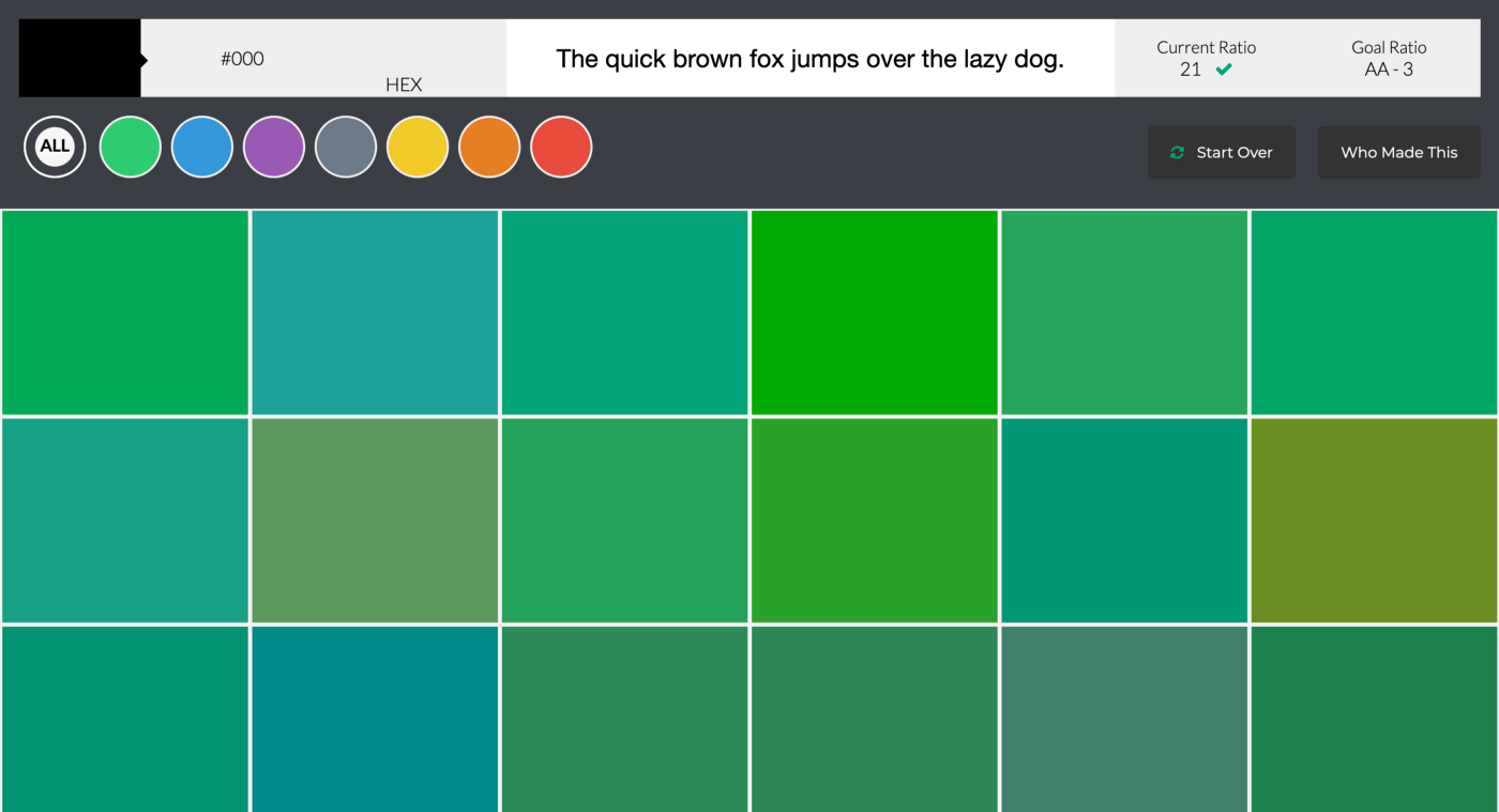
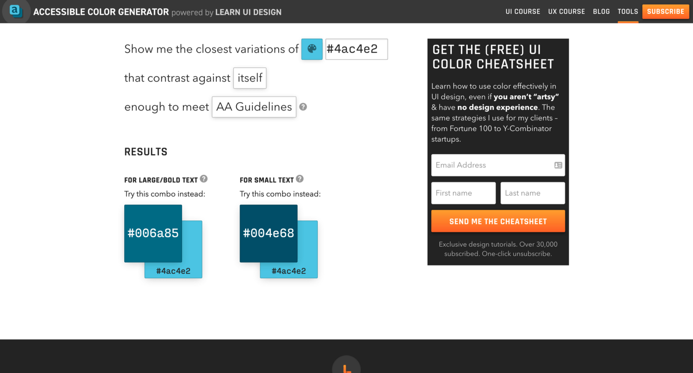
• Data Viz Color Picker and Accessible Color Generator
DVCP is particularly helpful when you need to choose colors for data visualizations. It helps you create a palette that has equidistant colors in it, which is important when you want to differentiate data. ACG is another nice tool made by the same team, that shows you the closest variations of a particular color enough to meet WCAG guidelines. More on this in the next section about Contrast.
Contrast
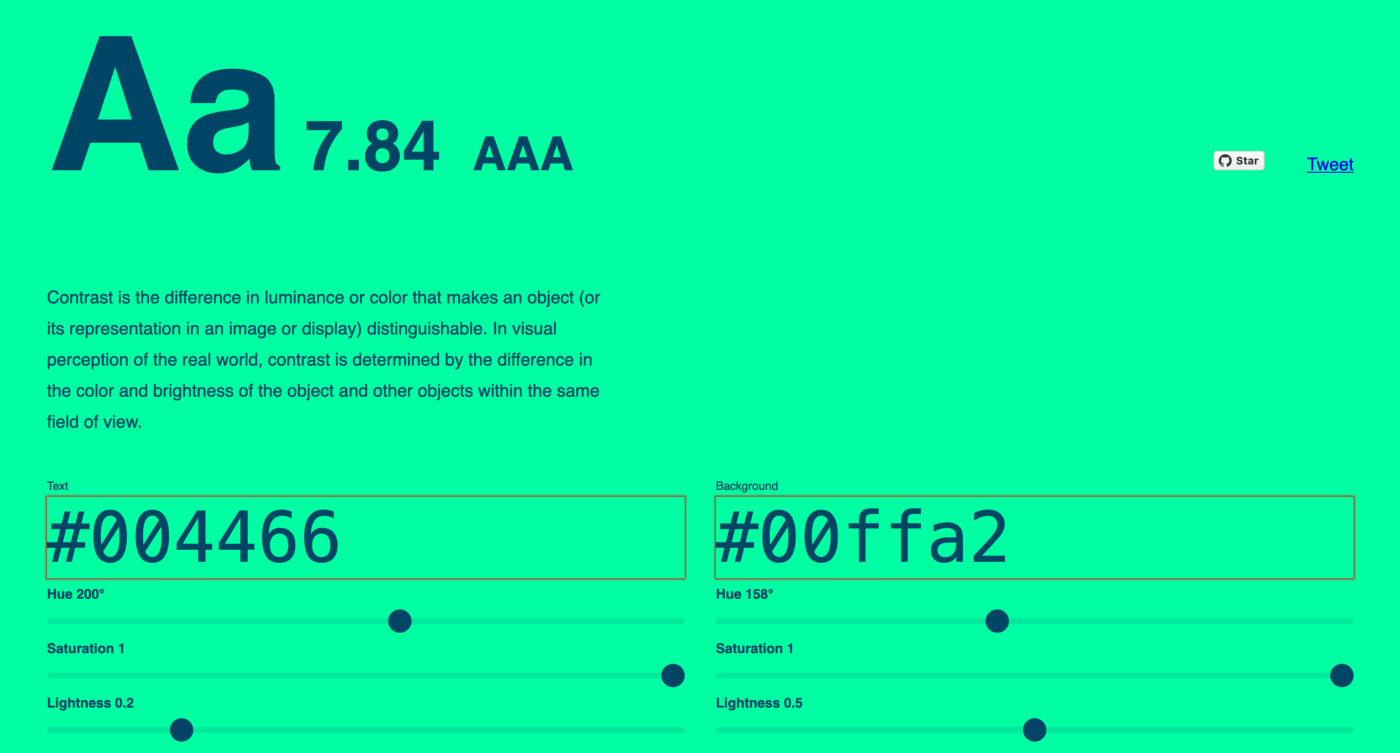
From Wikipedia, contrast is “the difference in luminance or color that makes an object (or its representation in an image or display) distinguishable. In visual perception of the real world, contrast is determined by the difference in the color and brightness of the object and other objects within the same field of view. Because the human visual system is more sensitive to contrast than absolute luminance, we can perceive the world similarly regardless of the huge changes in illumination over the day or from place to place. The maximum contrast of an image is the contrast ratio or dynamic range”.
As designers, we need to understand the importance of contrast when designing UIs and websites. The text must be readable no matter what background color it has, and other key elements like buttons and links should also clearly differentiate. Add to this a set of well-defined text hierarchies and a good amount of white space, and you have a solid starting point.
Recommended resources
There are many good resources that I would like to recommend:
Understanding Web Accessibility Color Contrast Guidelines and Ratios | CSS-Tricks
If you couldn’t check the links above, one thing you need to know is that the WCAG has defined a set of guidelines that when followed ensure good accessibility. One specific criteria is focused on Contrast:
Success Criterion 1.4.3 Contrast (Minimum) (Level AA): The visual presentation of text and images of text has a contrast ratio of at least 4.5:1, except for the following:
Large Text: Large-scale text and images of large-scale text have a contrast ratio of at least 3:1.
Incidental: Text or images of text that are part of an inactive user interface component, that are pure decoration, that are not visible to anyone, or that are part of a picture that contains significant other visual content, have no contrast requirement.
Logotypes: Text that is part of a logo or brand name has no contrast requirement.
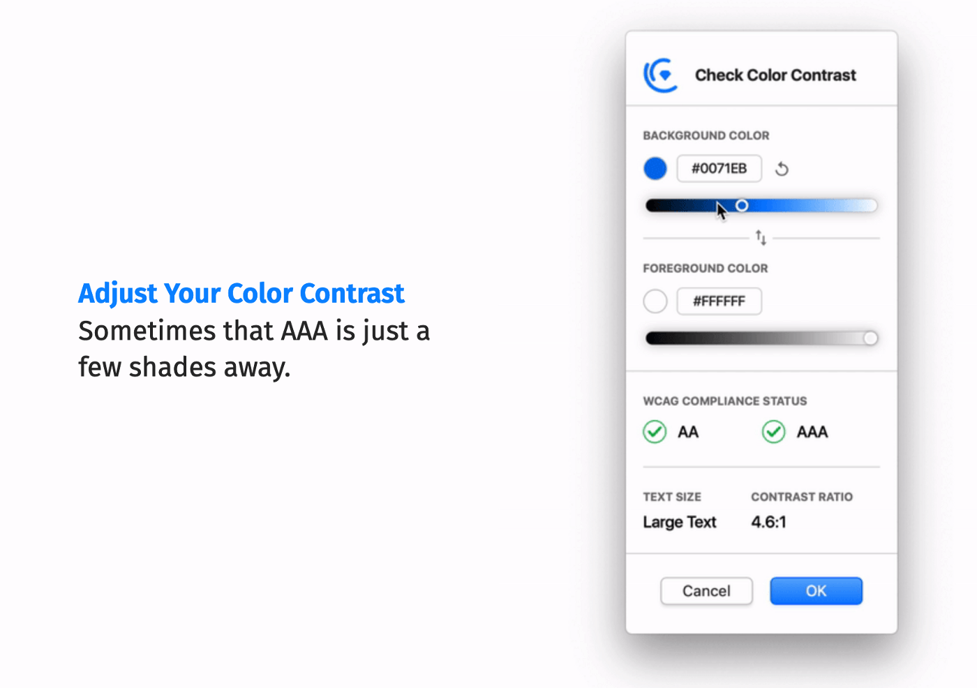
Tools
By checking that text in paragraphs, buttons, labels and all the typical UI components have good contrast ratios won’t affect your design process at all. I’d say its fairly simple if you use any of the following tools. Just keep in mind that most of them do similar jobs. You give them 2 colors to compare and they will tell you if the contrast ratio passes. Choose the one that suits you best.
- Accessible Brand Colors
- Colors that look and work great for everyone
-
Colors - A nicer color palette for the web.
• Colorable
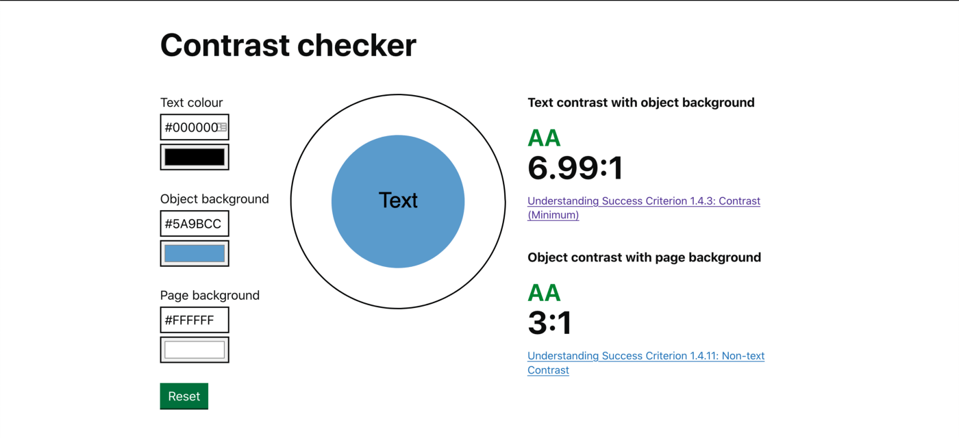
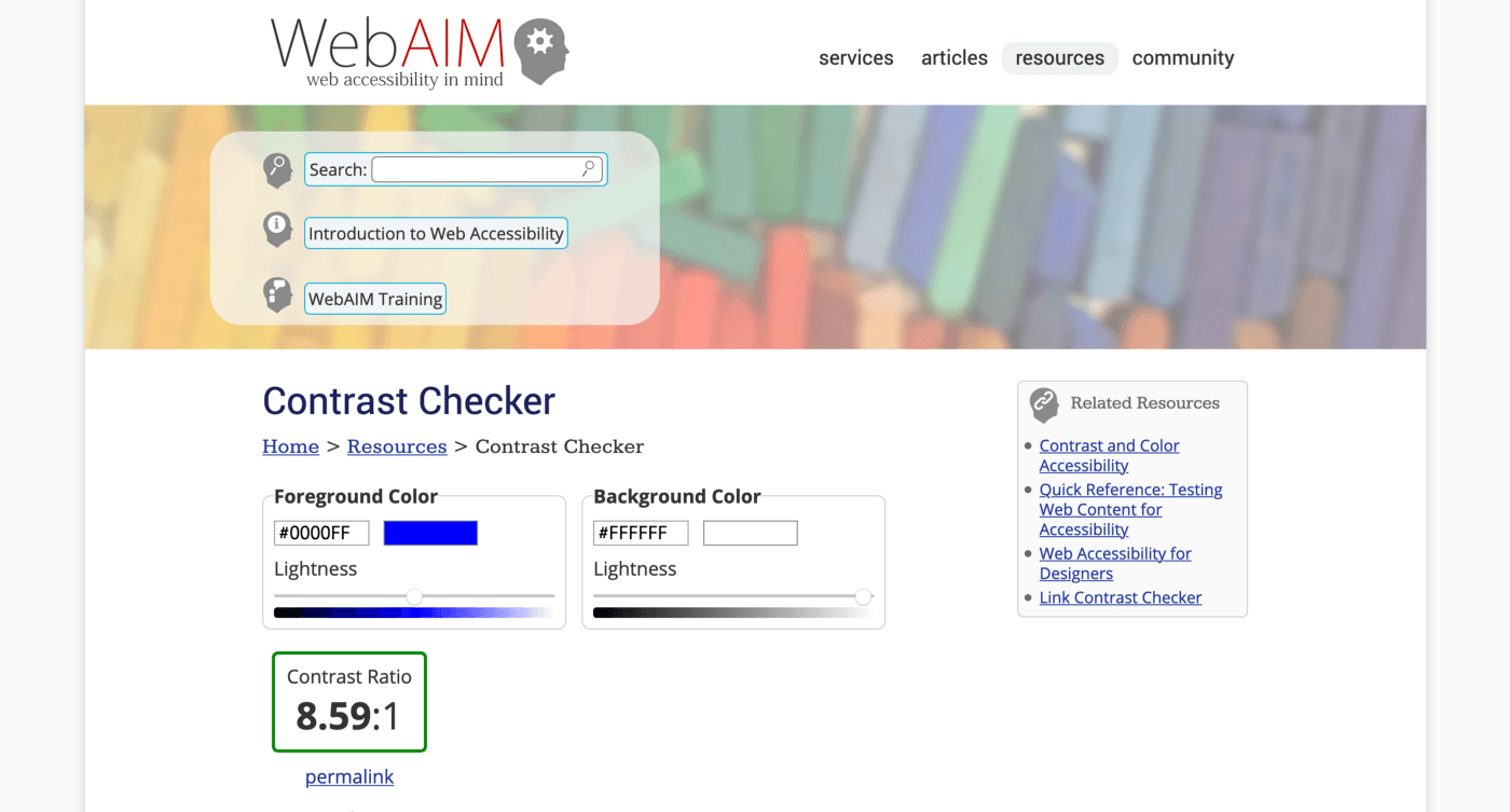
• Contrast Checker
Note: you may need to referesh multiple times in order to wake up the project if it went inactive https://contrast-checker.glitch.me/
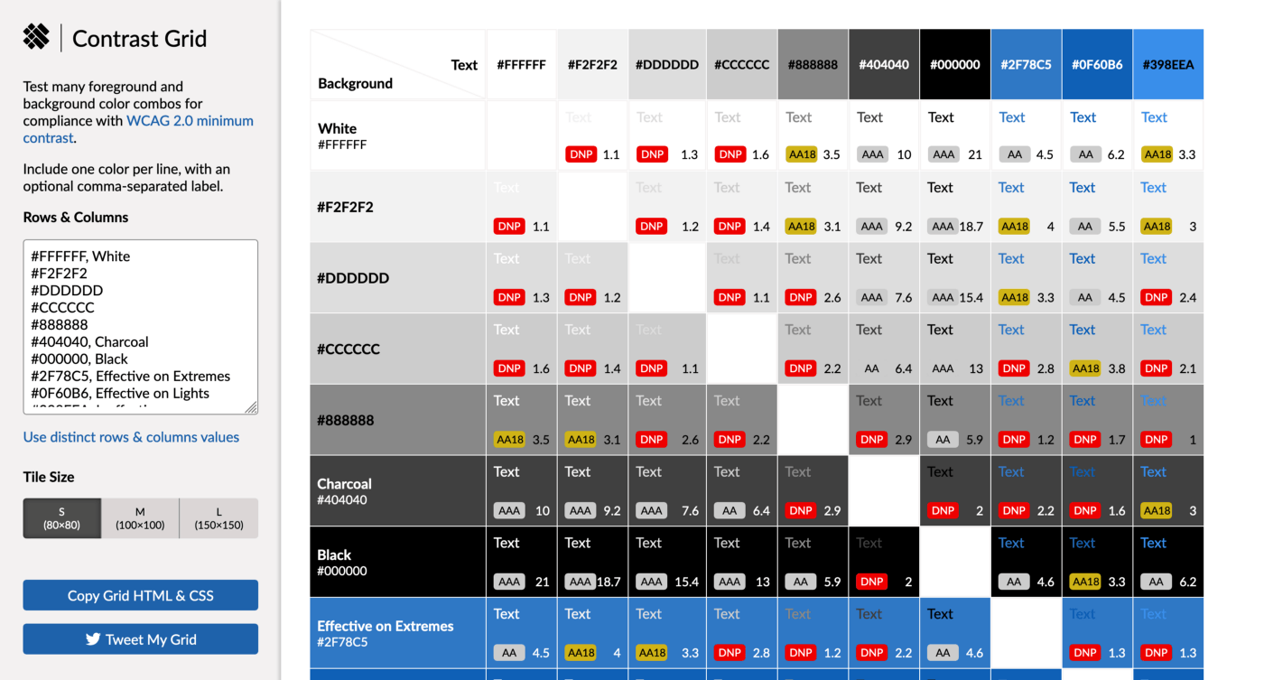
• Contrast Grid
- Contraste
- Deque Color Contrast Analyzer
- Colour Contrast Analyser (CCA)
- Hex Naw - A color accessibility tool built by The Scenery
- Color Tool - Material Design
- Color contrast checker, analyser and color suggestions
- Randoma11y
-
Contrast for UI
• WebAIM Contrast Checker
Color blindness
A person who is color blind is unable to distinguish between different colors, they tend to see them in a limited range of hues. Colorblind can’t fully see red, green, or blue light. There are various types of color blindness, even there are extremely rare cases where people can’t see any color at all. The most common form is known as ‘red/green color blindness’.
There are many causes of color blindness, most of them are due to genetic factors. Still, all of us could become colorblind because of diseases like diabetes, because of aging or many other reasons. In terms of numbers, color blindness affects approximately 1 in 12 men (8%) and 1 in 200 women in the world. This means that there are roughly 300 million people with color blindness, that’s a lot of people to consider while we are designing!
The WCAG has another criterion that is related to Colorblindness:
Success Criterion 1.4.1 Use of Color (Level A): Color is not used as the only visual means of conveying information, indicating an action, prompting a response, or distinguishing a visual element.
This means that color should not be the only way of conveying information to users. For example, on error messages don’t rely on the color red alone, include an icon next to it, and make sure you are as descriptive as possible. When you give instructions don’t refer to color only. On data visualizations like bar charts, make sure that users can identify them with another visual cue other than color, like a pattern. Although Trello’s example is used for their labels, it’s a nice approach overall.
Recommended tools & reads
- Accessibility: Improving The UX For Color-Blind Users - Smashing Magazine
- How to Design for Color Blindness
- We are Colorblind
-
Toptal Color Blind Filter
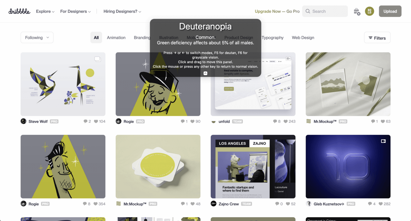
• Color Oracle
It’s a simulator available for Windows, Mac, and Linux that works by creating a full-screen color overlay on top of your screen that simulates the different types of color deficiencies.
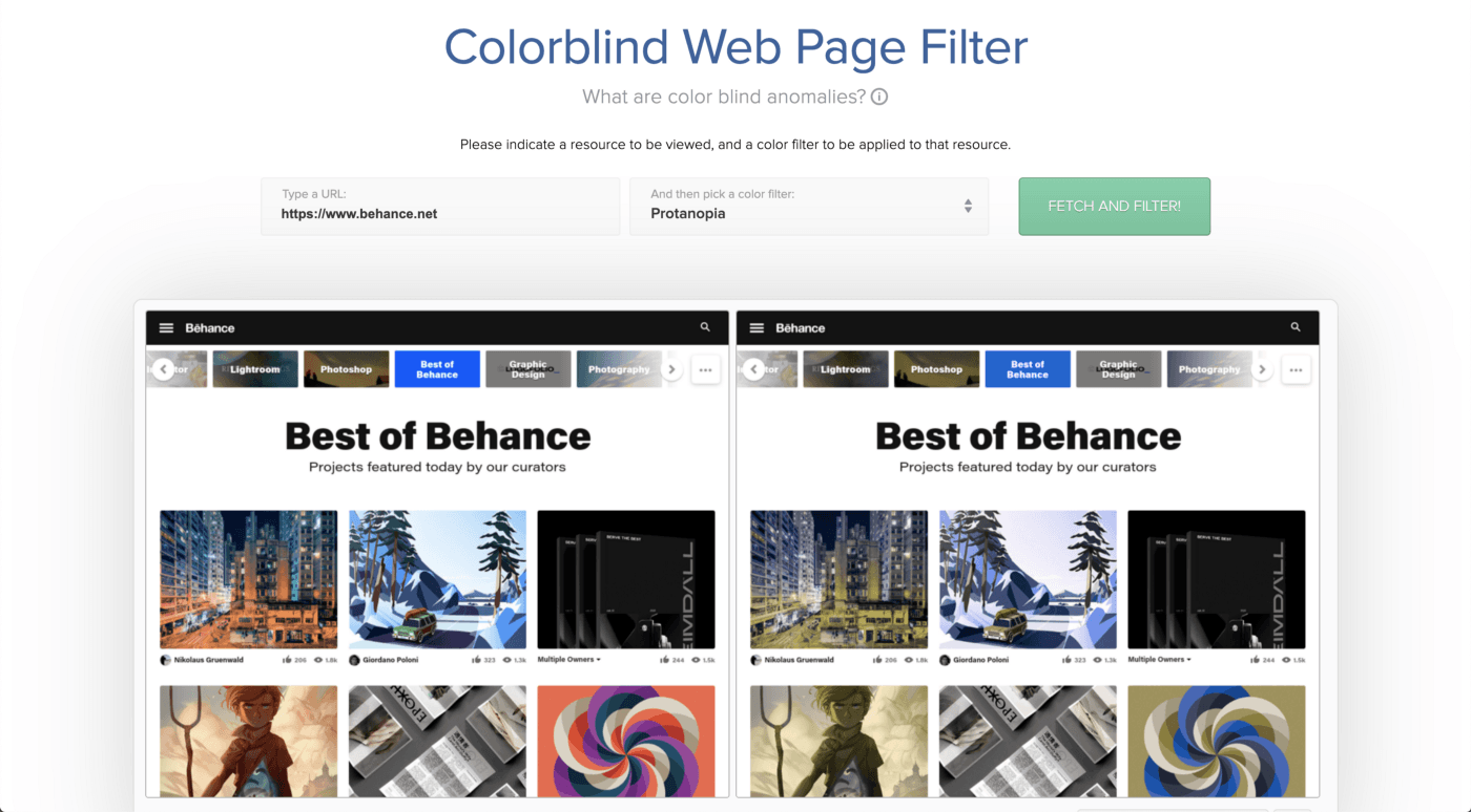
• Toptal color blind filter
This tool works by entering a URL of the website you want to check and then select a filter. You can preview websites and compare them with a normal vision version of it.
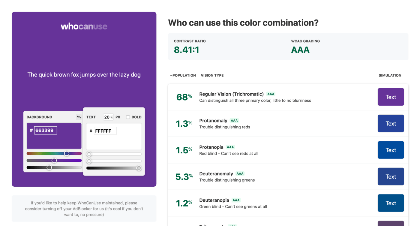
• Who can use
It’s a tool that can do contrast checks and simulates how a color is perceived by people with different types of color blindness.
Dyslexia
According to Mayo Clinic, dyslexia is “a learning disorder that involves difficulty reading due to problems identifying speech sounds and learning how they relate to letters and words (decoding). Also called reading disability, dyslexia affects areas of the brain that process language.”
Although Dyslexia can’t be cured, we as designers can help them read and understand the text by making sure that it has good legibility. The British Dyslexia Association has defined a Style Guide on how to display written material that I found pretty useful to have at hand. It consists of a set of principles that outlines how words, letters, and line-spacing can improve readability. Here is a list of some of them:
-
Use sans serif fonts, such as Arial and Comic Sans, as letters can appear less crowded. Alternatives include Verdana, Tahoma, Century Gothic, Trebuchet, Calibri, Open Sans.
-
Font size should be 12–14 point or equivalent (e.g. 1–1.2em / 16–19 px). Some dyslexic readers may request a larger font.
-
Larger line spacing improves readability and should be proportional to inter-word spacing; 1.5 / 150% is preferable.
-
For headings, use a font size that is at least 20% larger than the normal text. If more emphasis is required, then use bold.
-
Add extra space around headings and between paragraphs.
-
Ensure hyperlinks look different from headings and normal text.
-
Use single color backgrounds. Avoid background patterns or pictures and distracting surroundings.
-
Use sufficient contrast levels between background and text.
-
Left align text, without justification.
-
Avoid multiple columns (as used in newspapers).
-
Lines should not be too long: 60 to 70 characters.
-
Here is a link to the complete document.
If you think that some of these interfere with your design language, consider giving the user the possibility of adapting it to its reading needs. Some of these principles relate to the topics mentioned before, so it’s important to remember that when we take them into account we are helping people with other disabilities too. And again, we are improving the experience for people that haven’t dyslexia or any kind of disability at all. Everyone wins.
More resources
While researching I came up with these interesting posts by UX Booth:
And this presentation by Seda Maurer, Jennifer Keene-Moore, Anita Cator, and Sophi Marass with more information and suggestions.
- What is Dyslexia? - Yale Dyslexia
-
International Dyslexia Association - …until everyone can read!
-
Line Height Adjuster
Plugins
Here is a short list of extensions for the most common UI design tools that I have used and recommend. If you want to look for more accessibility-related plugins for Figma click here, for Sketch here, and for XD I think your only option at the moment is Stark.
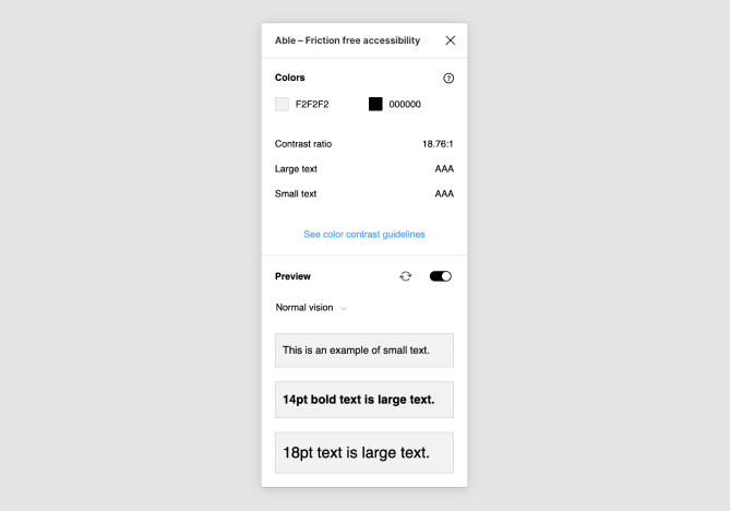
• Able
With this plugin you can check the color contrast of two objects that you have selected. If you change one of the selected items it will update the contrast results on the fly so you’ll avoid having to re-run the plugin many times for different comparisons. And it also allows you to test for different types of color blindnesses. At the moment it’s my personal favorite 🙂.
• Cluse
Cluse is a nice Sketch plugin that works similarly to Able. You select a text layer and a shape and then run it. What I like about it is that you can change the colors from the plugin itself until you have a passing ratio.
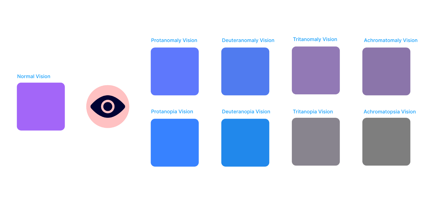
• Color Blind
This a Figma plugin that allows you to view your designs in 8 different types of color vision deficiencies. It works by cloning your selection and creating versions with the colors changed to match a different type of color blindness. Each copy is contained within a group that is labeled with the color blindness type.
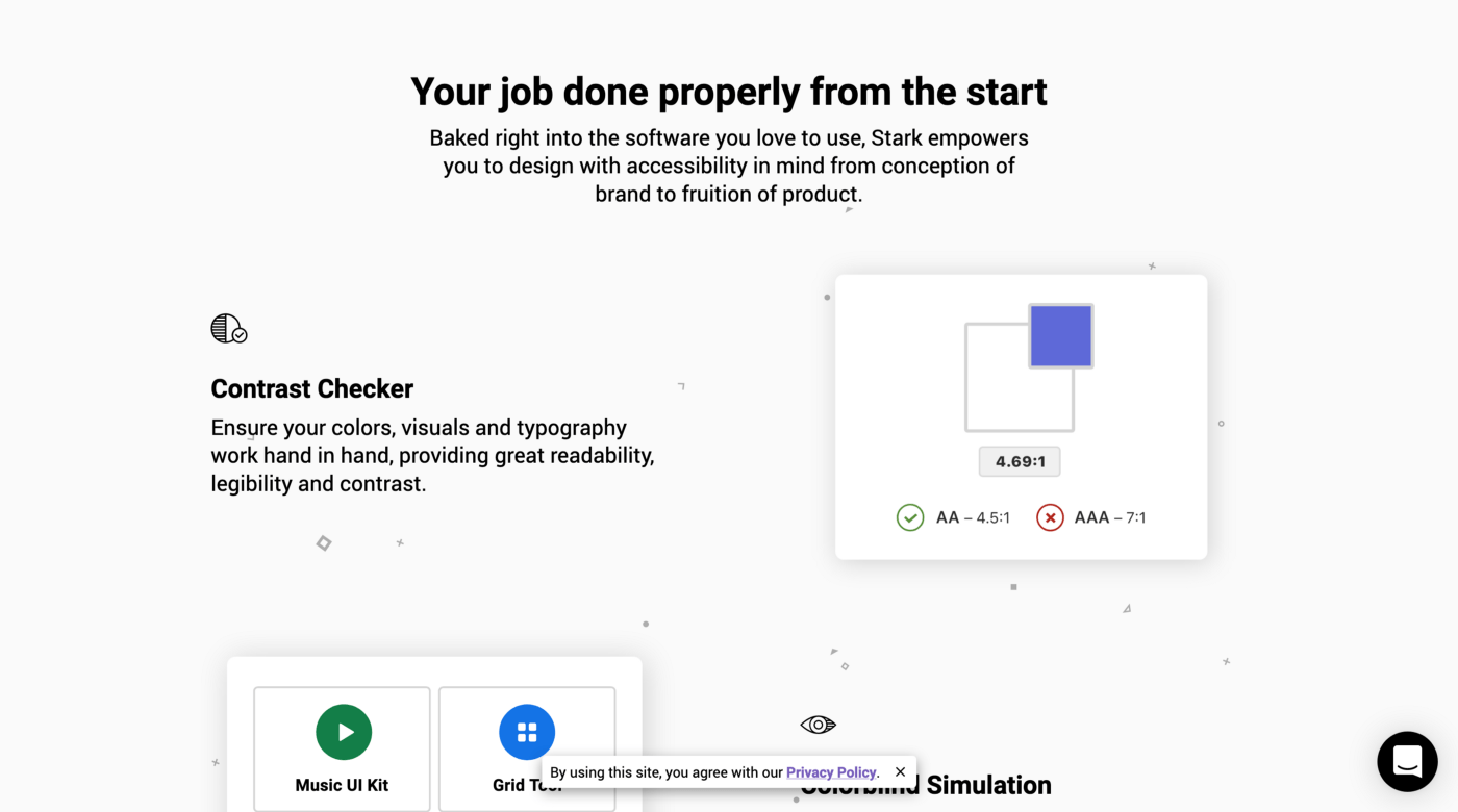
• Stark
It’s a plugin available for XD, Sketch, and Figma. It consists of a suite of accessibility tools that allows us to check contrast and simulate colorblind issues. I’m curious about the color suggestions new feature that’s coming.
What about the code?
If you are looking for tools to check the Frontend, I’d suggest you take a look at my previous post which is aimed for Devs and QAs.
You made it to the end! This post has become longer than I expected, so I’ll add some last words to finish it.
We the designers, developers, and everyone else involved in creating digital products are telling a story. It’s part of our work to ensure that these stories are available to everyone and that they can be experienced in the best possible way. To do so, we must rely on Accessibility and User Experience. I’d like to think that both are faces of the same coin. They both exist to deliver the best possible digital experiences regardless of users’ abilities and situation.
Luckily, there are lots of resources out there to help us achieve this. At the end of the day I believe it’s just a matter of better organizing our processes to make room for accessibility.
I hope you found these posts as interesting as it was for me to write and research about them. Let me know in the comments section what you think, recommend tools I may have missed, or whatever you want to say.
Let’s continue making the web a better place for everyone, it’s on us! 💪
More Resources
- Designing for accessibility is not that hard - Inside Design Blog
- Accessible by Design
- Color Contrast And Why You Should Rethink It - Smashing Magazine
-
Inclusive Design Principles
Thanks to Sergio Fermanelli and Iago Rodriguez.
