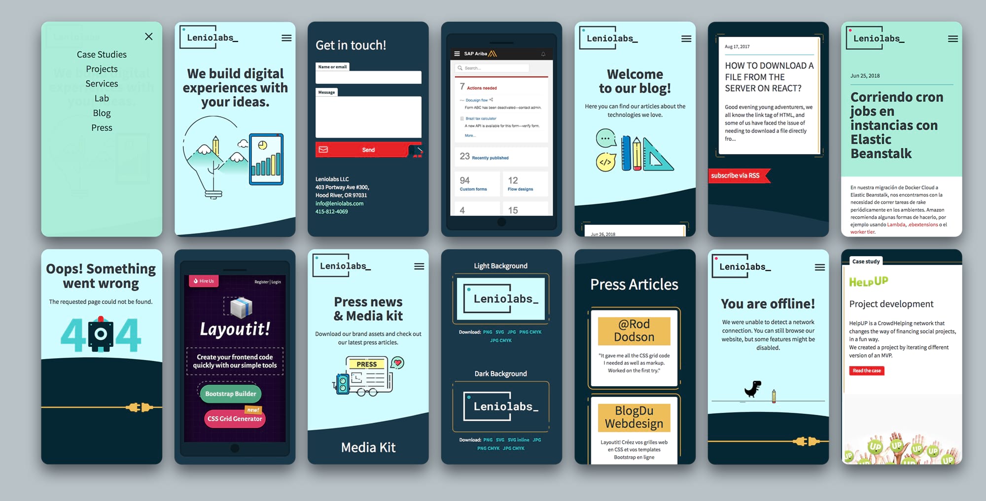
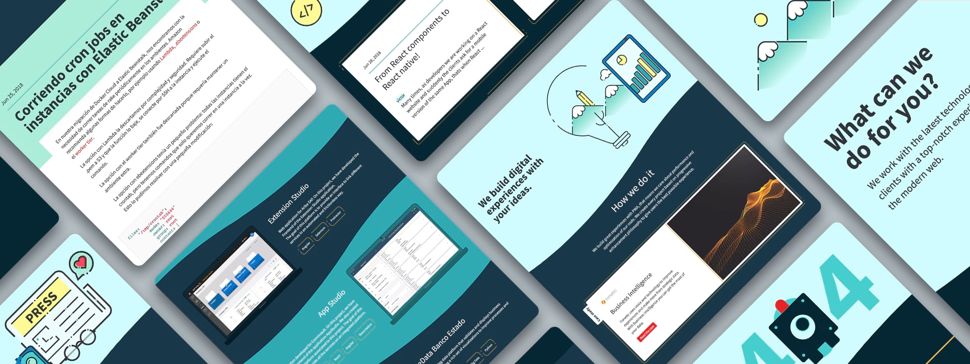
We wanted to build a site that reflects and communicate our identity in every way possible. We saw an opportunity to apply what we had learned in the last years, to make something personal, unique, useful and accessible. We also wanted to add a blog where anyone on our team could write interesting articles. The site would have to be alive and interactive, a modern Progressive Web App with a clear brand message.
The problem
As many small companies when they start, we couldn't find the time to build our ideal website. For a long time we had a simple template that we modified and pasted our logo into it. Templates are a nice and fast solution when you don't have time or resources, but they carry some conceptual and communication problems, as you end up adapting the content to the format. We were not communicating our identity but filling the spaces that the template gave us.
There was a lack of identity in our website: it was not original, our personality was not there, it didn't have our voice and we didn't have complete control over the code. The same thing happened with our logo, there was no concept behind it, no clear message to communicate.
First steps
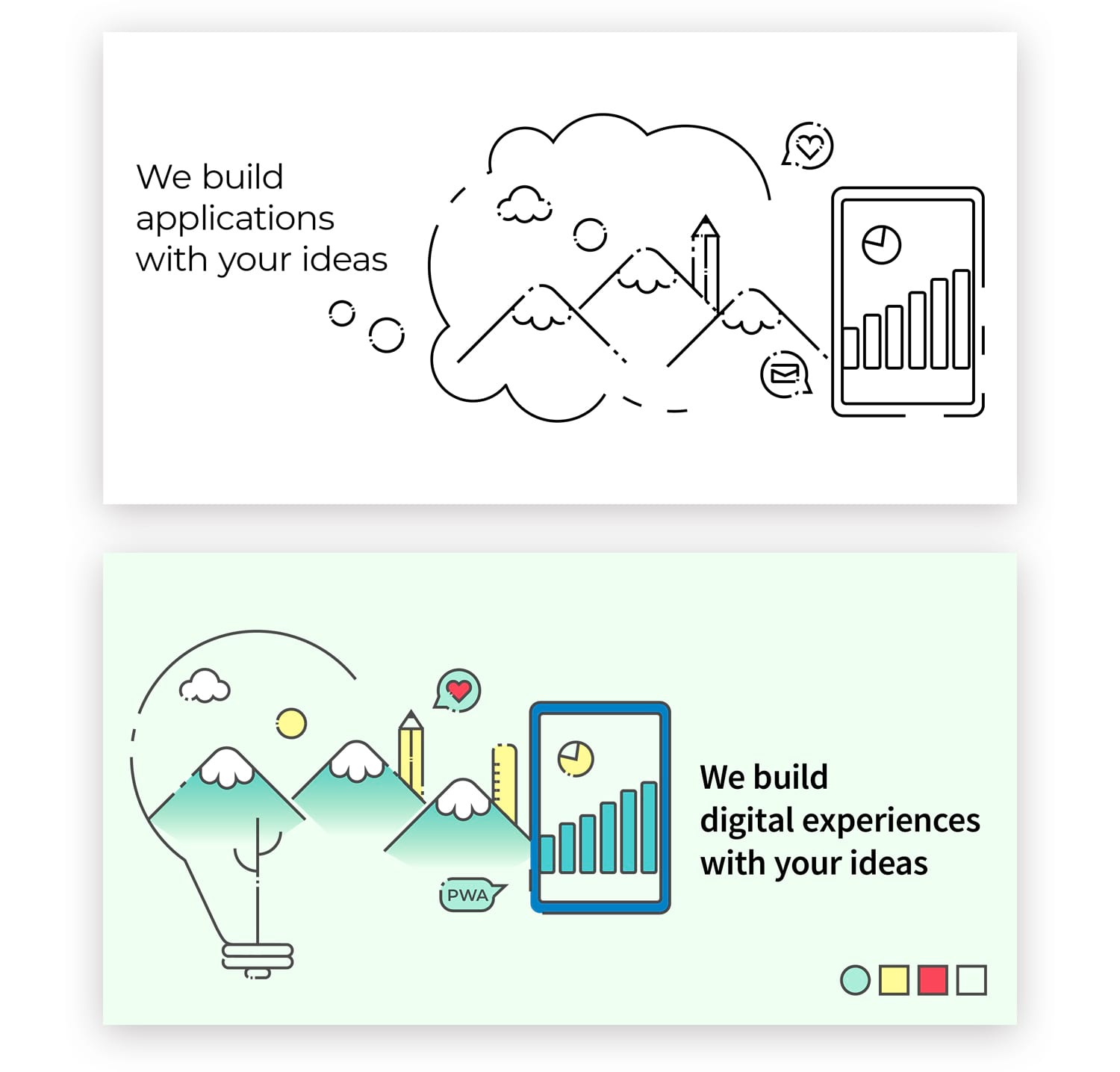
Synthesizing our message in a banner
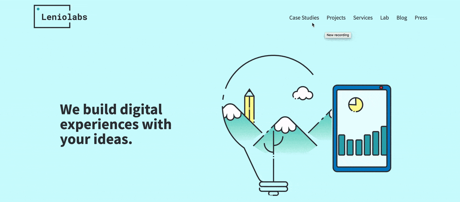
How to summarize what we do in one sentence? How could we represent that idea with just one image? This task helped us to put a frame on what we do, what we have to offer. We started discussing what kind of company we wanted to be and what kind of clients we wanted to have. While looking for the best way to define our message, we began approaching the visual design and illustration styles, testing color palettes, fonts and patterns.
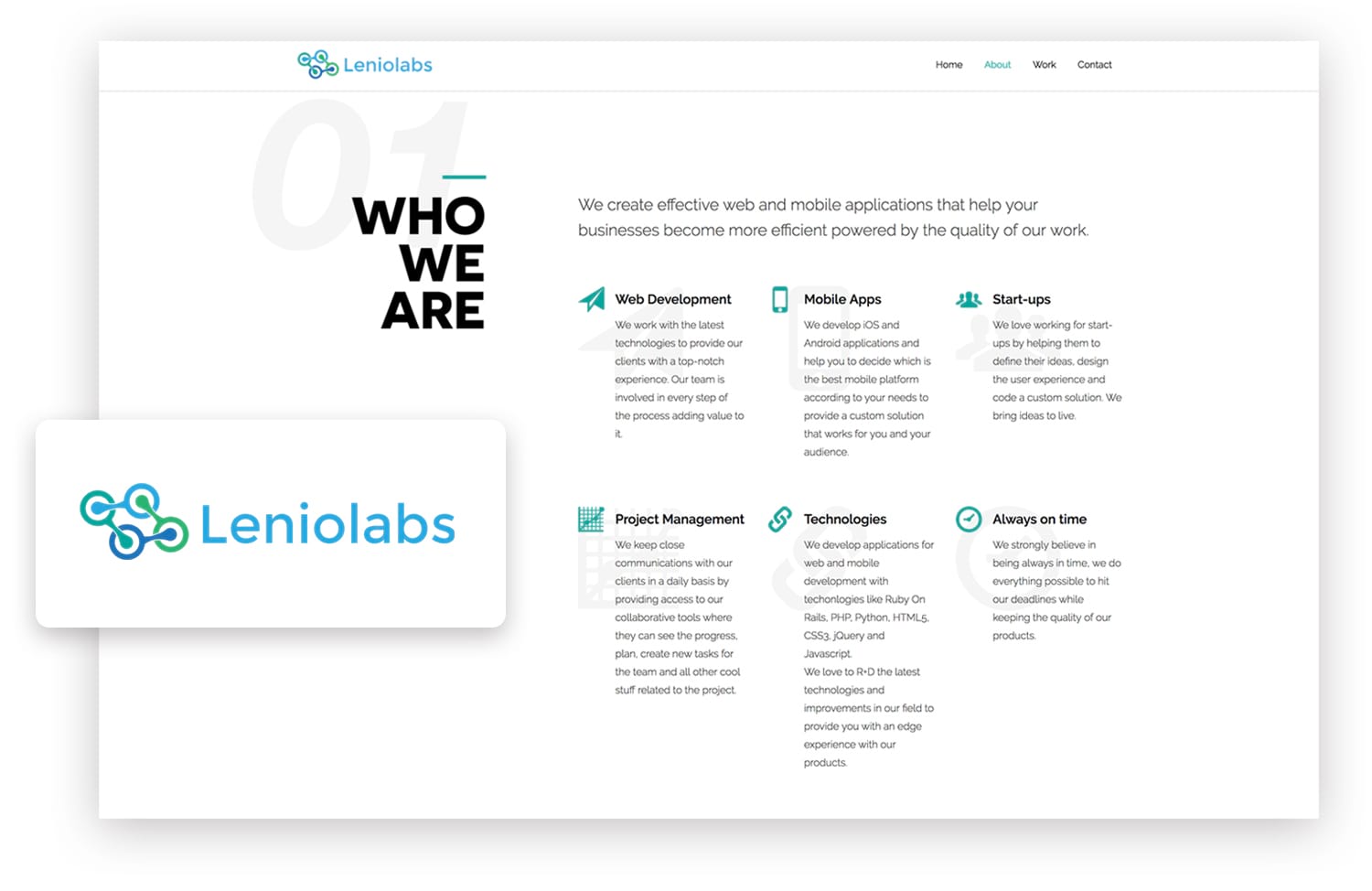
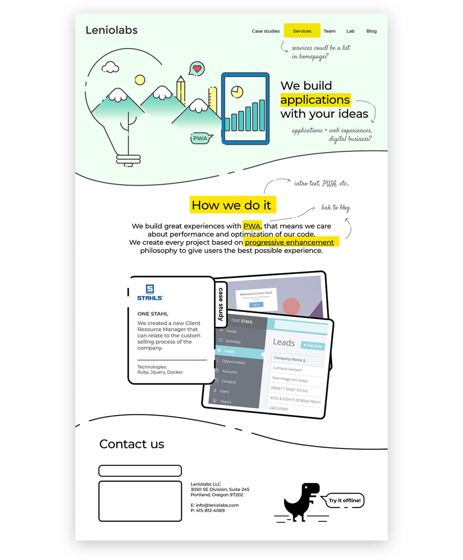
Defining the structure
What elements should go to the homepage and what information should have its own section? The content of the homepage ends up defining the navigation. We started with just one wireframe to open the discussion with the team about our voice and tone, nav sections and their order in the site, our tagline and presentation. After making these primary decisions we were able to start coding and make the rest of the visual decisions from there.
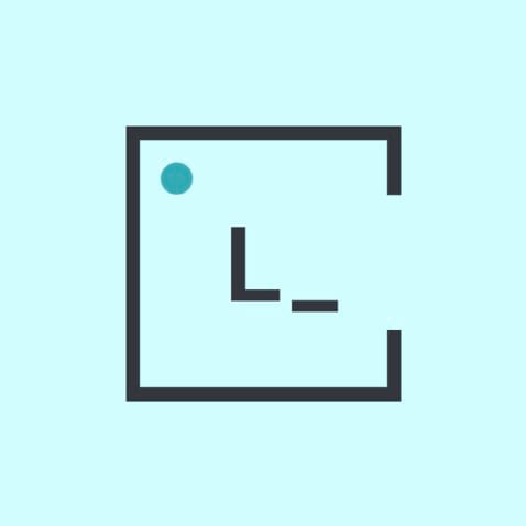
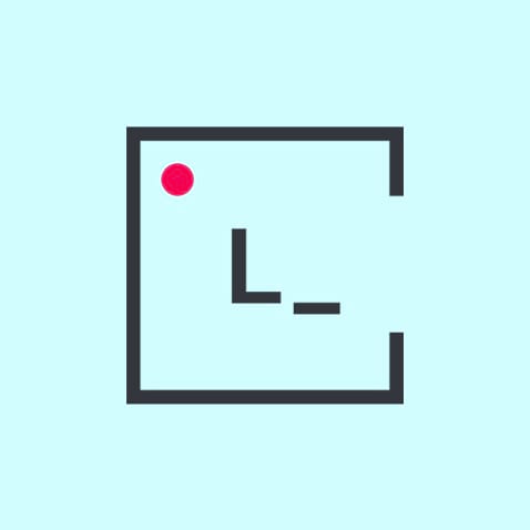
As web developers, the main place to show our logo is our website. With that in mind, we wanted to take advantage of the web platform and language. Working with the concepts above, we came up with a logo that is always active, ready to code, with a state for offline mode and an isotype for mobile homescreen and favicon. We achieved that with SVG and CSS animations.
Second Stage
Designing with code
It was easy to move faster with all the previous definitions. We made the final visual decisions in this instance: with SASS, native variables and Google Fonts we were able to apply and test everything with a small amount of effort. It was convenient to actually see the final typography and color palette with all the elements interacting with each other. Starting with mobile first:
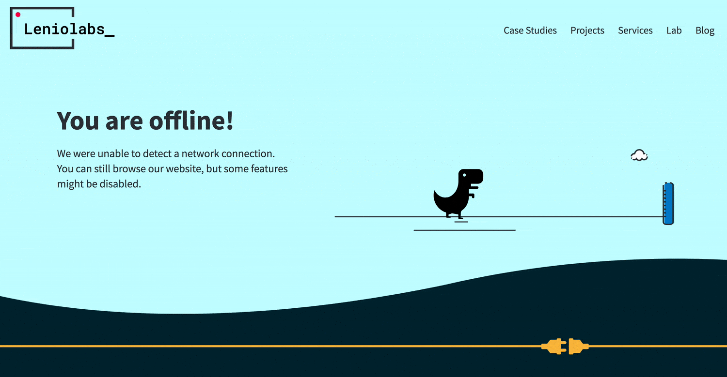
PWA: setting the dino free!
Our site is a Progressive Web App: if your browser has support (and if you visit us often) you will be ask to download a homescreen icon to your device. From then on you’ll have a direct access to our site. You’ll be able to navigate the pages you’ve already visited without internet connection, not to mention the benefits of a very fast loading experience and an offline fallback page.
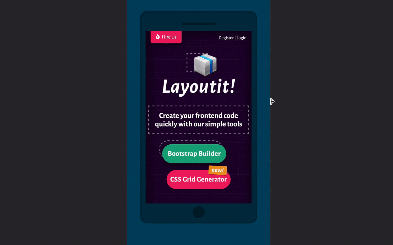
Why not use CSS grid? A small part of our site was built using layoutit.com/grid with a flexbox fallback for older browsers. CSS grid is great for layouts that are designed in two dimensions.
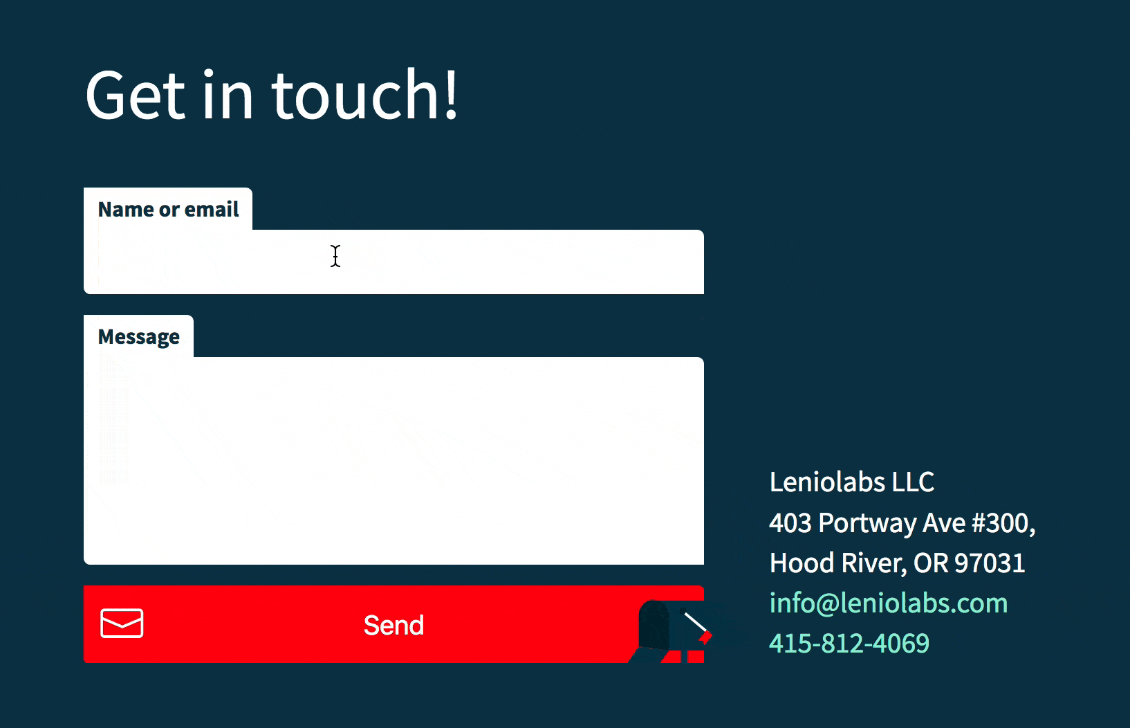
Keeping the site fresh was one of our primary goals, so we made an introduction to every page with a small CSS and SVG animation, including a contact form with user feedback.
Accessibility matters
We took care of building our code with semantic headings and structure, HTML5 tags, ARIA landmark roles, SVG titles and descriptions, alt tags, keyboard navigation and color contrast.
Performance
We reduced the weight of all our images for a better experience. We only kept the size we needed and applied compression to all files. We also added WEBP format for supported browsers reducing file sizes with minimal quality loss. This makes our website faster consuming less bandwidth. We used optimized inline SVG almost everywhere. We chose two Google Fonts, one for the site and one for the logo. As we only need 9 characters for the brand, those are the ones we ask for:
Our best tools to improve performance and accessibility were the ones that Chrome dev tools uses for Audits (Lighthouse and axe), Yellow Lab Tools, among others.
Having fun
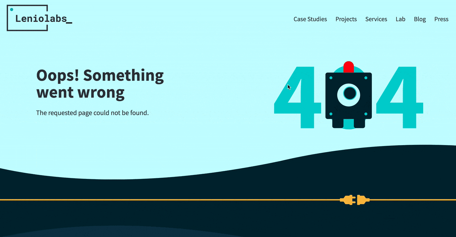
There are no rules for designing a 404 page, here we combined SVG and a bit of Javascript to make our robot move its eye following your every move. For our portfolio we made responsive images with scrset. In smaller devices you’ll find smaller files with the mobile version of our projects. These are shown in responsive silhouettes drawn with CSS gradients. We achieved that adding just one class to our < img > tag and one extra element for the laptop base, see the code here.
Final touches & future plans
Setting up the guidelines
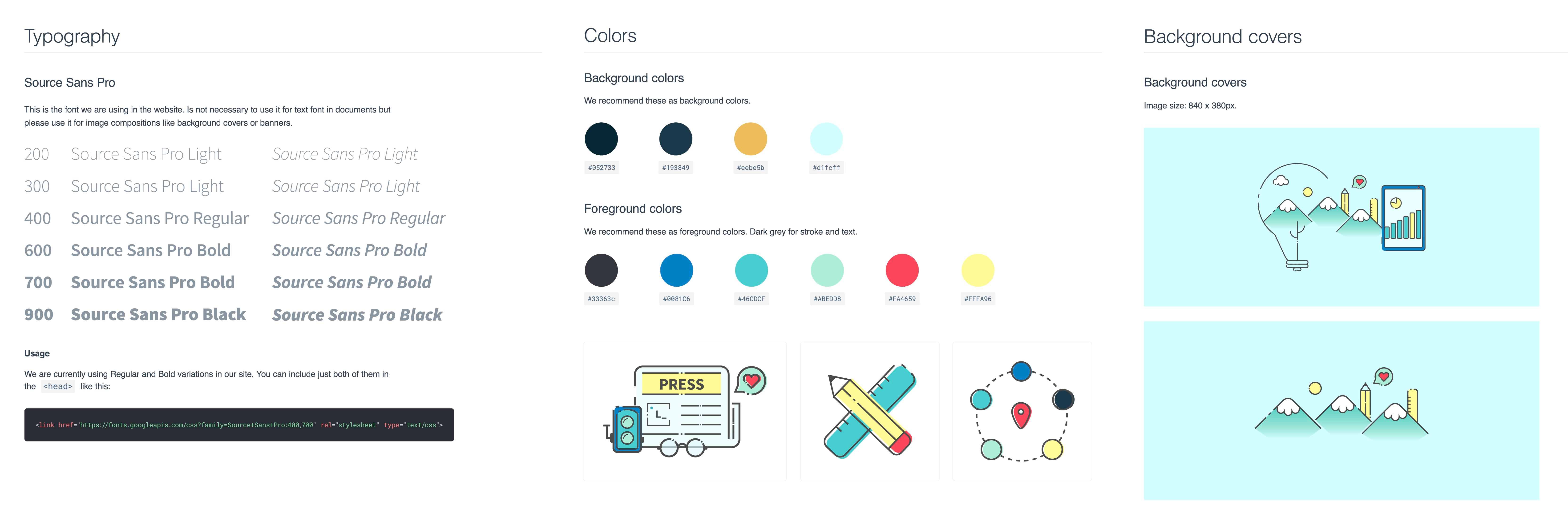
This is a work in progress and will be for sometime, we are building a section where anyone can download all assets and visual guidelines to our brand. It includes our logo in different versions and explains when to apply them, the styles of our site and all original files to build background covers, and links to Codepen templates ready to use.
Leniolabs_ LLC
7901 4TH St N SUITE 300,
St Petersburg, 33702 infodelete@leniolabs.com 541-288-4033