
Adding value to our client's platform and brand

Not every brand guidelines include definitions for the usage of photography, illustrations, or image styles. Far from being a problem, this could mean a great opportunity for a redesign project. While filling the requirements for a software development project, we discovered the chance to create and explore a visual universe to enlarge our client's identity.

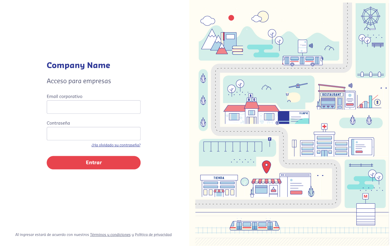
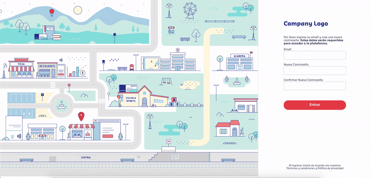
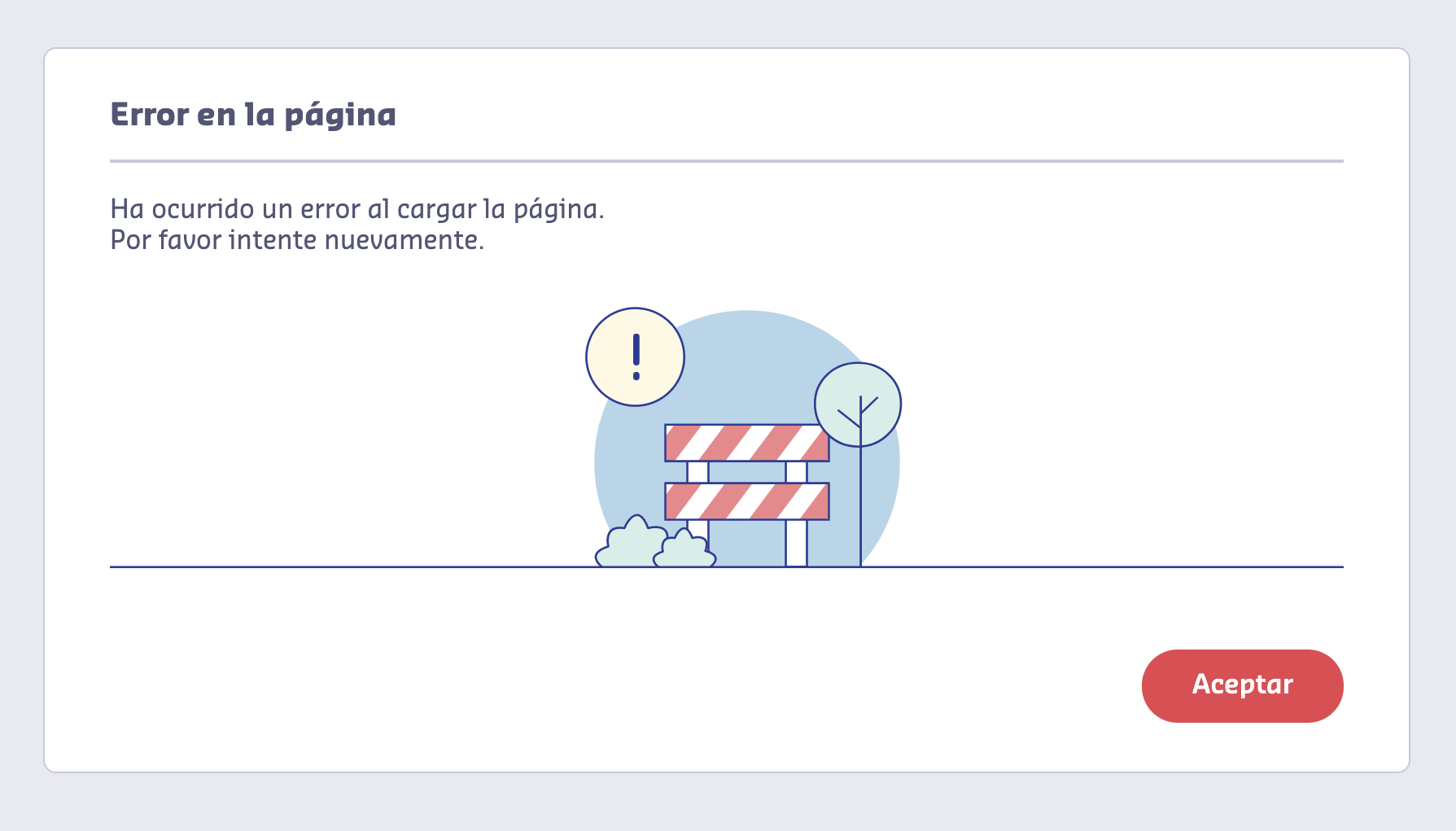
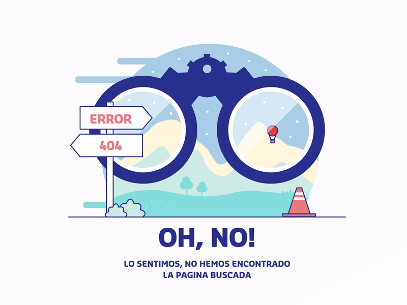
On every website, we find common spaces to communicate the users what is happening. Places where the message is simple but we can tell a story. Some of them include logins, error pages, and loadings, they communicate the same on every site, and that is what let us space to release some creativity.

The starting point

open

Our client's business is about offering services to other companies, along with a platform to manage them all internally. Our job was to redesign and rethink that custom service platform. At the moment we started, they had this website that was built some years ago, it had an old design and some performance and accessibility problems. They needed a fresh start from the visual and technical perspectives; something simple, fast and easy to use.

It was not the typical product site with a homepage that explains what they do and try to sell it. The end-user of this platform is a customer that already bought our client's services and uses this platform to manage them in their own company. When they reach this site it's because they have credentials and they already know what the site is about and what it is for.

On a good side, the users are somehow prepared for what they are going to find in the link. They will come to this platform (maybe more than once a day) with a task to complete. So it's important that we don't distract the user from what they're trying to achieve.

We wanted to make the design visually attractive without cluttering the site, so we had to pick the right moments and the right ways to do that. Our goal was to find those places where we could make the site friendlier and integrated into the brand, keeping in mind that the main purpose of this platform was to manage services in a simple way without disturbing.

The client's brand was defined with a color palette, typography, and style for icons, but there wasn't a strict guideline for images and illustrations, and that's where we saw an opportunity.

Choosing the right format

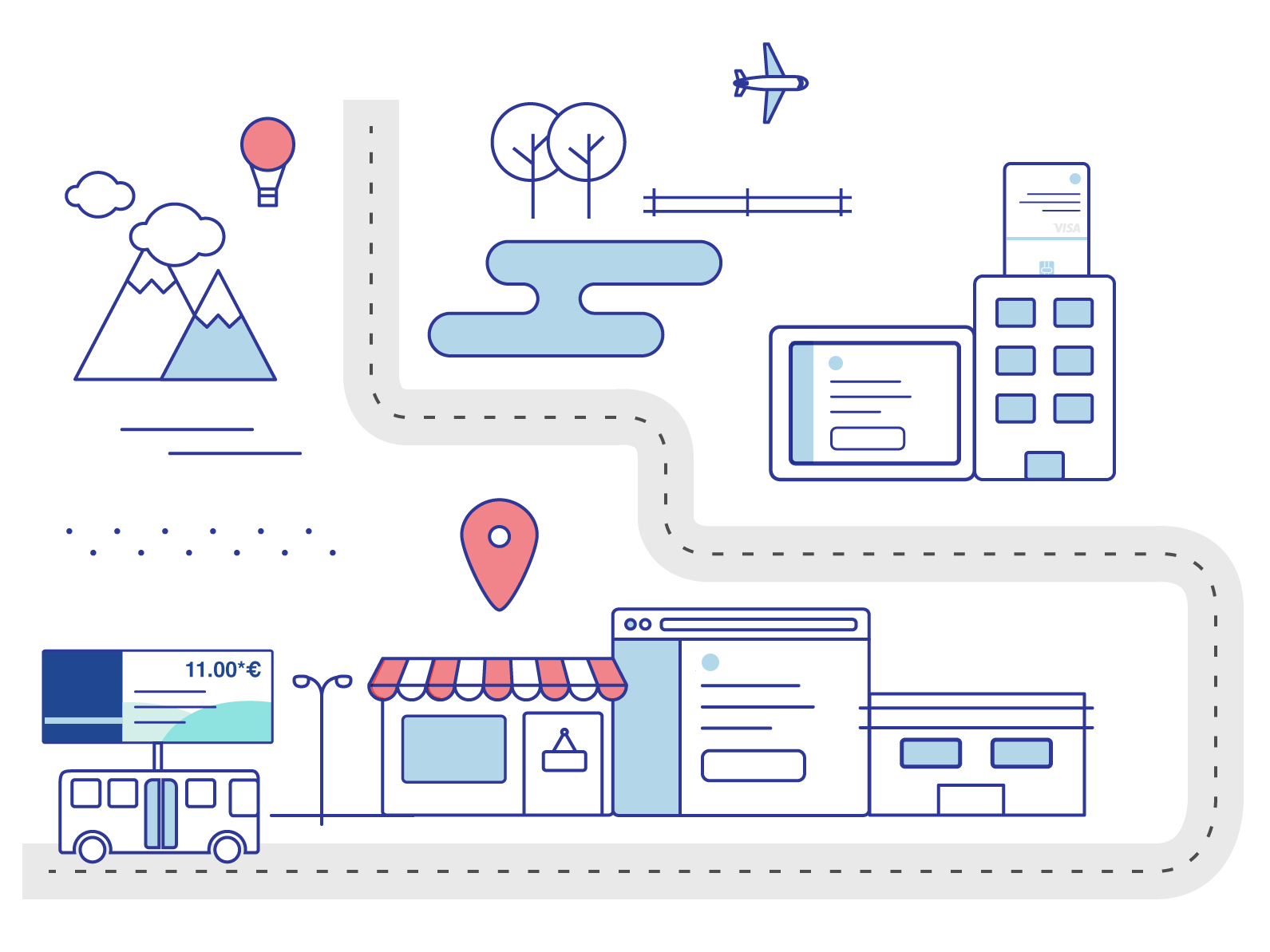
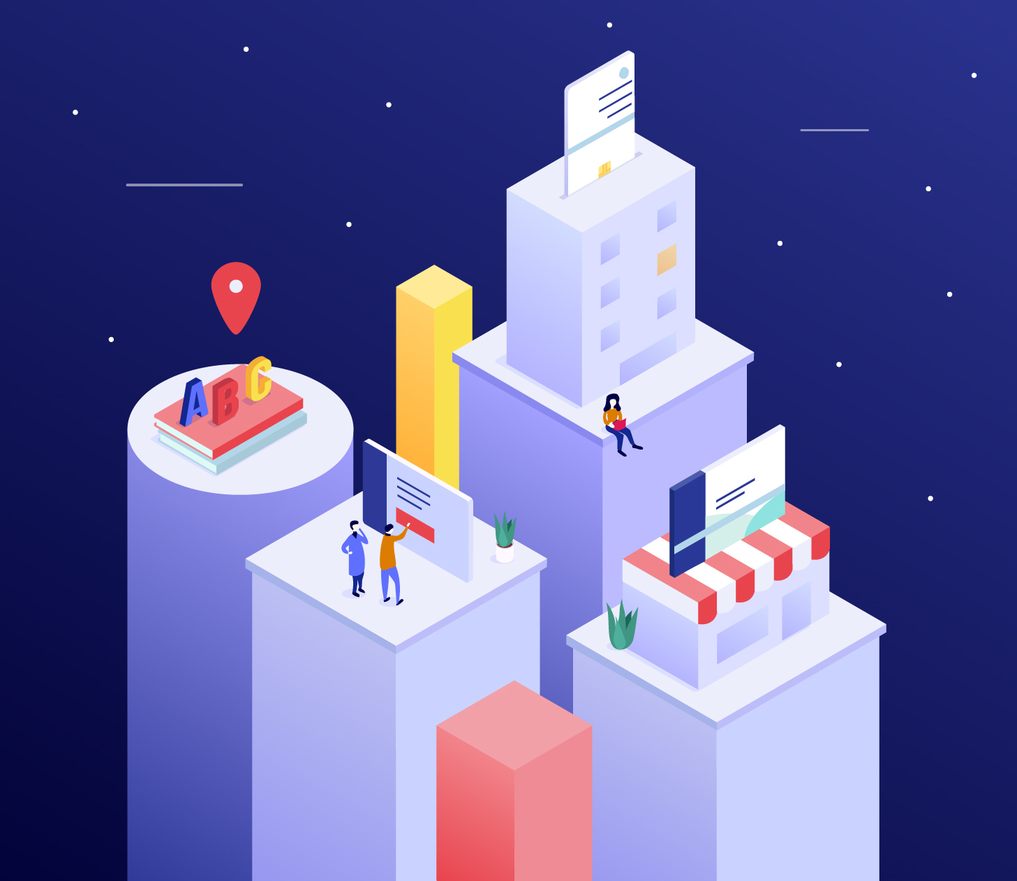
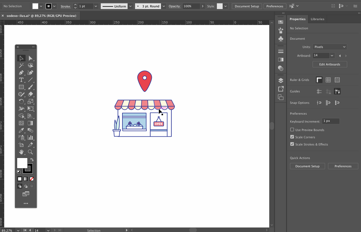
We discarded the usage of photography; photographs are more suitable for products, more literal and grounded in reality. This site was neither about selling a product nor describing it, but to improve the experience of the current users and help them achieve their tasks easily. Illustrations work better to express concepts and we could easily include our client's color palette to make them part of the brand. Besides vectors can perform much better than raster images (we'll talk more about this later).

Our proposal was to build a graphic universe with illustrations to show all these services in a friendlier way and also to communicate when something was happening on the site. By building this graphic universe we are adding a new ingredient to their guidelines, a different solution to approach any possible visual communication problem. We are not offering a set of images, but a set of rules for a language that they can continue to develop and make part of their brand.
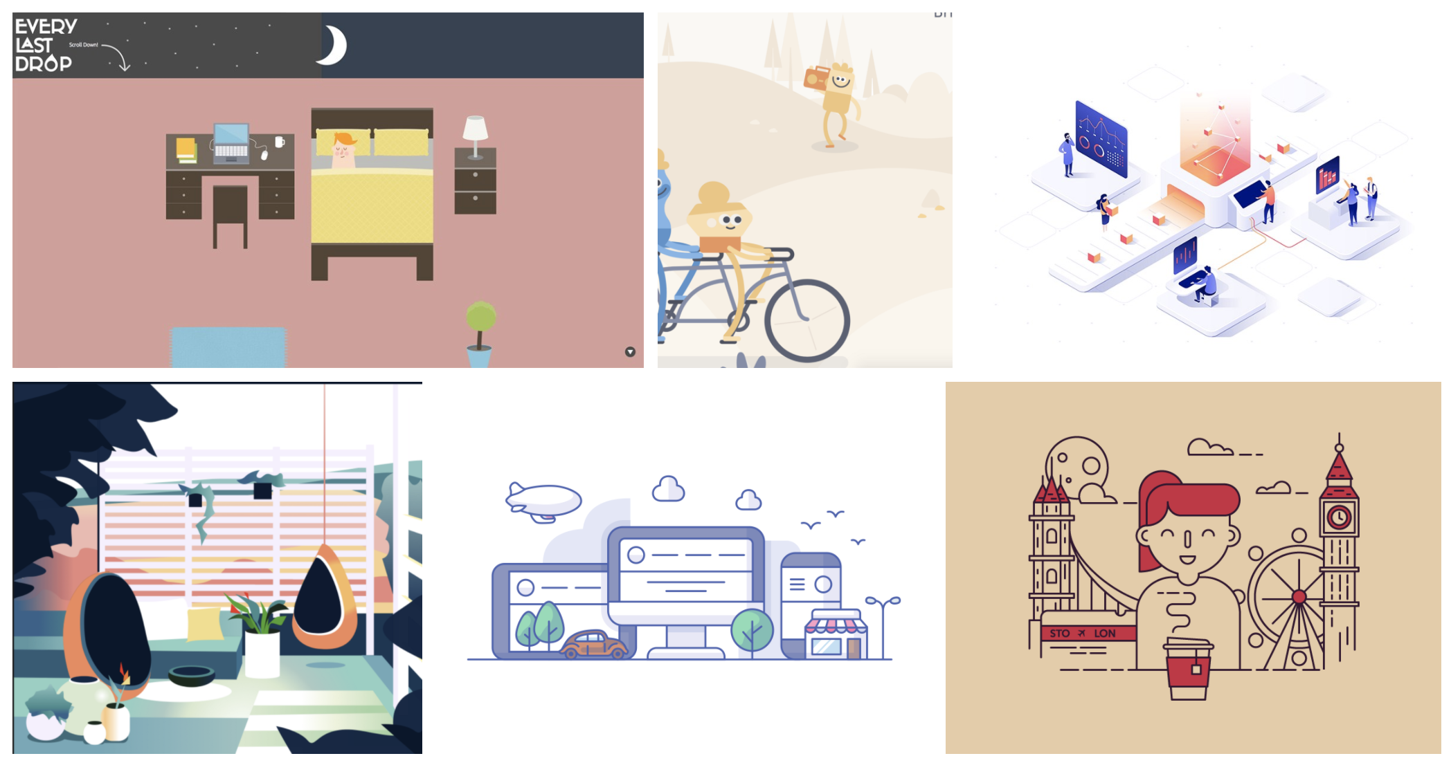
References First

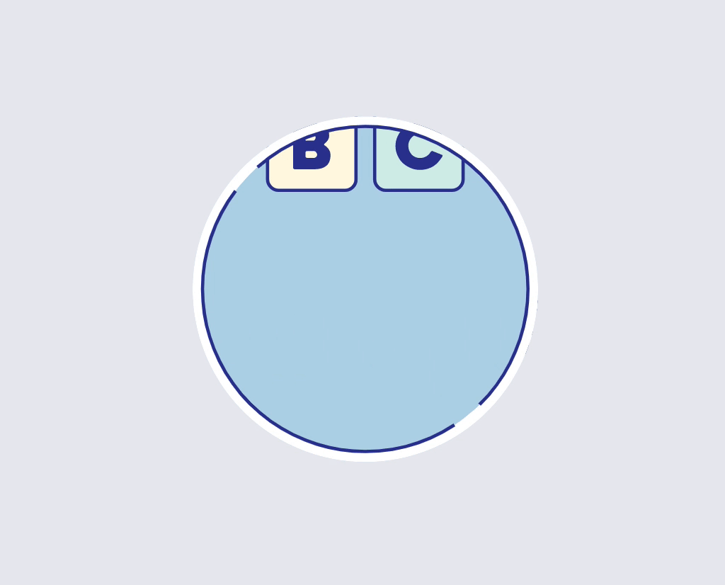
We started by showing the client some references for illustrations with a small description so they could decide which style represented them the most. Some of these images included different perspectives, dimensions, depths, characters, stroke styles, gradients, and solid combinations, rounded and sharp edges, between others. From the beginning, we discarded any complex texture, effects, or super realistic illustrations. We knew that performance will pay if we keep it simple from the beginning.

Illustration references

Test the idea with the style

The client picked two options, so we delivered some small sketches to start testing the styles and at the same time, talking about the ideas to represent. The Login is the first page the user will see, and also the one with more space available for creation. Here, we wanted to show a city where all our client's services coexist, so we sent some drafts of the city with both styles:

flat design example isometric design example
First drafts for styles

As we mentioned before: when the users reach the login, they are aware of what the site is about. We didn't need to explain the services in detail but to think about how the illustration could reinforce their benefits.

After they picked one final style and the idea of the city was approved, we started discussing which elements to show and how to represent them.

login page with illustration
Drafts of illustrations and Login page

This phase was about getting the best way to show all the scenes of the city until the login design was finished. That is when we started focusing on the code and choosing the best way to implement those illustrations on the site.

Using SVG

As soon as the illustration was approved, we exported the file from Illustrator to SVG as it's the best format to use vector images on the web. We decided to use the SVG code inline in our document because this approach allows us to make use of animations. Let's review some of the benefits of inline SVG:

There are a few ways to export the SVG, the easiest one is to copy the vectors from Illustrator and paste them in a text editor. As simple as that:

Copy/paste from Illustrator to text editor

The software adds a lot of code that is not necessary and hurts legibility and performance. That's why a tool like SVGOMG helps us optimize the file in a fast and easy way. Going deeper in that direction, manual optimization is usually part of our process. Another important thing to keep in mind is that SVG is a great ally for accessibility.

Now we have our code clean and we can start adding classes to the elements we want to animate. In this case, CSS animations were enough to build these simple animations.

This was the result for the Login page, the SVG illustration weights only 42k after optimization:

Login with micro animations
Login with micro animations.
Note: The gif is displaying in a loop but some animations where playing just once.

After the main animation was ready, smaller instances were easier to build. Once users get into the site, different scenarios of the city appear as they navigate it. Other instances included a loading animation, an error message, and a 404 error page:

loading
Loading
error modal
Error message
404 animation
404 error page

Using the same illustration language we started building a graphic universe, communicating different messages with the same visual identity. We are able to enrich any instance in the site in a non-verbal way, without losing identity but widening our possibilities of expression.

Two valuable conclusions

Vector graphics gave us the possibility to work with SVG and CSS animations. This way we could deliver low file sizes with the best quality resolution and performance that adapt to every viewport.

Agile methodologies were not only used in the development instance of this project, but also in the UI/UX definition phase. We made the illustration process part of our sprints, which helped us to get the client involved at every point of the process. Their input was key, they gave us the freedom to propose a new language, they guide us through the way to make it work with their current brand and committed with every detail of each illustration.

city illustration

Leniolabs_ LLC
7901 4TH St N SUITE 300,
St Petersburg, 33702
infodelete@leniolabs.com
541-288-4033

Databricks SOC 2 Certificate SOC 2 Type 2
infodelete@leniolabs.com